Let's hop straight again to Day 5 with some GUI tweaks, meta discussion and some more settings to change.
Rant Warning - wall of text ahead (then some REAPER things).
Currently using REAPER 6.16
Contents
Menus and Windows
There was a comment on the previous article discussing menus, actions list and floating windows.
I'd like to address some of these points from my perspective, and rant a bit. To keep things a bit balanced, I spent a day thinking as a "purist" (my default mode of thinking about UI) and as a pragmatist (your average user, including me when I'm using software and not consciously thinking about it). I believe both the purist and pragmatist are capable of recognizing the pros and cons of something within their mental model of how things should work.
Rant Mode: Purist
Menus
I hate menus, except when I love them.
GOOD
- Well-designed menus display a hierarchy of information - This allows you to browse for things that you only vaguely know you want. Foo Window not displaying a column that you want? No clue why? Let's go to the "View" menu, then the "Columns" menu then... oh, there it is, "Don't display Empty Columns" is checked. We had no way to know which type of columns weren't being shown, because we couldn't see them. Well-designed menus give you a path to discovery.
- Search - macOS provides a search mechanism for all menus (
cmd-shift-/). This means that I can search for any command that I forget, as long as it's in a window. It's a universal discovery interface for nearly any program.
BAD
- Menus are slow to use - Using a menu requires multiple cycles of context searching, a minimum of 2 clicks, some reading, and blocking your interface with a dynamic overlay. It's possible that the menu might not be in the same place every time, and it's possible that your menu item may require a context switch to find. This is terrible for UX.
- Menus are inconsistent - This is particularly bad on Windows, and even worse on Linux environments. Each app developer thinks they know the best place to put menu items, and it's rarely where other developers put them. Worse still with cross-platform apps that put a common menu item in the idiomatic place for another OS.
- Menus can exist anywher - If menus were always in the same place, the two previous complaints would be alleviated or eliminated, but THEY ARE NOT. There's multiple layers of context sensitivity baked in to menus. Where are you clicking? When are you clicking? Which thing is active? Which window is that thing in? How fast are you clicking? Which button are you clicking? Which OS are you clicking on? Did you install the correct thing? Are the options correct? etc... Any of these change can present you with a different menu. Each layers of these is eating away at your magic number. You might be lucky enough to a small short-term memory stack and menus don't bother you much, or they might directly affect your thinking processes. Either way, it's there, gnawing away at layers of context and exposing the limits of your cognition.
To summarize, I believe menus serve a great way to explore functionality, but when relied upon for regular use they erode the user experience in subtle but destructive ways.
Windows
Floating windows suck. Always.
BAD
- Window Z-Order is variable:
- Window can get lost - An errant click, or even an intentional one, can send the window out of view. How do you get it back? It depends!
- Restoring is hard - Many programs have issues with re-opening with window z-order matching the last saved or closed state.
- Do you want the last project window state? Or the last program window state? Neither? Both?
- Window Z-Order is not variable (floating windows/always-on-top):
- Window obfuscates content behind it. Could instead be a dockable window which retains position and context.
- Window does not respond to OS management usually (modifier-tab commands).
- Window usually does not respond to other window management tools.
- Rarely retains its own top-level menu, relies on other controls. Search menus don't work in macOS in most cases.
- Restoring is hard - Floating windows often rely on other context, and once again: do you want it saved with project state? program state? both? neither?
- Focus - every OS has issues with applying or retaining keyboard focus on floating windows. Are you typing in the window? Maybe? Maybe not? How do you get focus back over there? Grab the mouse... oh no! Now you have two inefficiencies at play.
Putting content in floating windows is unpredictable. It decontextualizes functionality by taking the interactive elements and separating them from what you are interacting with. Their repeatability is poor (unless tied to the main UI). They complicate input focus. They eclipse potentially useful GUI elements behind them.
They're gross.
There's always a better alternative in GUI design than using a separate floating window.
Rant Mode: Pragmatist
Menus
Menus have their place.
GOOD
- Menus are good for beginners - Menus provide an immediate entry point to the software which requires minimal training. If you have a vague idea of the function that you need, you can find it in the menu faster than most other methods of discovery.
- Menus reduce long-term memory burden - Audio software tends to have 100(0)s of features/commands. A subset of a couple dozen are used by any given user. The user doesn't need to have all of these commands at the back of their mind, nor see them in the main interface.
- Menus provide a method of hiding information that's statistically unlikely to be used - This reduces UI clutter for average use, sacrificing clutter/inefficiency for low-probability usage commands.
- Menus don't need to be top-down, left-to-right ad-hoc windows - There are a variety of menu systems with varying distributions of benefits and detriments. Radial Menus are an excellent example, but other menu systems exist.
- Menus provide a common interface - What's the difference between a web browser and a 3d editing suite? Cut, Copy, Paste, New Window, Exit, Save As..., Export, Find etc... Menus provide a generic interface for information that's common between nearly all applications. Want some special version of "Paste"? It's probably in the
editmenu. Want to reset zoom? Somewhere inview. - Menus are amazing for accessibility - If you've ever tried to use your computer as a blind person would, then you'd quickly realize how important menus are. They're the near-universal gateway to software functionality, especially when most applications do not work well with screen readers other than browsing the menu system.
- Anything good for accessibility is good for you - Improving the ease of identifying software functionality via multiple input methods provides benefits to all classes of users. (As long as these are not optional and overlapping access methods!)
BAD
- Menu hierarchy necessitates an existing understanding of the software - Browsing any menu system is a painful experience, and effectively using menus to learn about software requires a baseline level of understanding of the domain. You may simply not even know what the words mean, let alone how to find "the function that does that thing". Relegating this discovery process to menus is painful.
- Menu design is hard - Forget about what is in the menus. Designing a menu system that isn't frustrating to use requires consideration of user mousing behaviours.
- Pauses - Lag when pausing on a menu so that a sub-menu opens is a delicate balance. Opening every menu on mouseover is overwhelming and graphically busy. Pausing to open a menu too long is irritating.
- Shortcuts - Almost nobody moves their mouse in rectangular sub-menu shapes. We move diagonally to what we want, which means that the cursor leaves the menu windows or it moves over other sub-menus. Sabotaging the user by closing the menu or opening another submenu is disasterous. (Note: Windows is notoriously awful at this, and macOS applications tend to be very forgiving.)
- This also factors in to opening lag. The user sometimes does want that 'seemingly errant' submenu to open because they know exactly where they want to go, and the initial submenu opening was a mistake. Preventing the advanced user from operating the software as desired can lead to losing "evangelizers" or people that contribute to the ecosystem. (like me?)
- Dimensions - Not every menu is small, thin black text on grey (which is a terrible scheme anyway). Some applications try to keep a consistent GUI, which might mean redesigning the menu system. If dimensions do not match system menus, then muscle memory is out the window. Managing menus across the application can be difficult to keep consistent (when it makes sense).
Windows
The whole OS is windows! (unless you using a tiling WM or similar... like I do). It's the dominant GUI paradigm for a reason.
GOOD
- Z-ordering of windows provides regular locations for background content - Assume that the user wants to change the crossfades for an item, and they can do one of two things:
- Open a docked/attached crossfade UI - Docked interfaces entail moving other GUI elements. Unless very carefully designed, the software may move the item that the user was working on. Annoying.
- Open a window - The location of all items on the previous screen are intact. Nothing moved. If the new crossfade window is overlapping my content, then the user can move the window. The item to be worked on retains its position.
- Windows de-clutter main GUI's - Windows provide a detachable source of GUI widgets, (hopefully) constrained to different functions. Separating these interfaces from the main window allows the primary GUI for common workflows to remain uncluttered.
- Windows support extensibility - Requiring external tool authors to integrate into an existing product, which they have no control over, is difficult on various levels. An interface system that relies on windows as a container for functions allows tool authors to integrate with this system by drawing in their own windows. The consistency of utilizing "function based" windows across the main interface and tooling helps provide a more familiar interface across all provided function interfaces.
BAD
- Windows are ugly - Software (like most DAWs) which attempt to provide non-native GUIs tend to still rely on natively styled windows. The inconsistent styling detracts from visual appeal, but more importantly can lead to confusion when the user is unable to immediately recognize which application a child window belongs to.
- Windows sometimes are an overload of information - It's relatively rare that a user wants to use all of the functions in a class of functionality. If the user wishes to change the right crossfade shape, then forcing them into a window with 30 other functions is a poor experience.
The twist
I separated out the concepts of menus and windows, but menus are windows.
Menus are a window system with rules about display location. Menus have pecking order bakend in. Menus restrict widgets to lines of highlighted text.
Windows have fewer (practically no) restrictions in modern desktop environments. You can display anything, anywhere, anytime. The flexibility provides the ability to do amazing things, but also implies a responsibility that many developers shirk.
Menus are easy. Windows are hard.
Developers, at least try to get your menus right before you start throwing modal dialogs and custom windows at me.
Practicality
I'm obviously a purist by default, but I understand that tradeoffs must be made at points, and not all users approach using software the same way that I do.
Configuring REAPER is an exercise in aiming for perfect, and settling for "almost good enough". The sheer amount of functionality can outweigh the difficulty in using it.
Screenset changes
Record (F4)
If you've followed along then you've noticed that moving from the MIDI screenset to the Recording screenset leaves the MIDI editor open, but smaller. I need to fix this.
I need the key that opens the Record Screenset F4 to do two actions: Close the MIDI Editor and load Screenset #2.
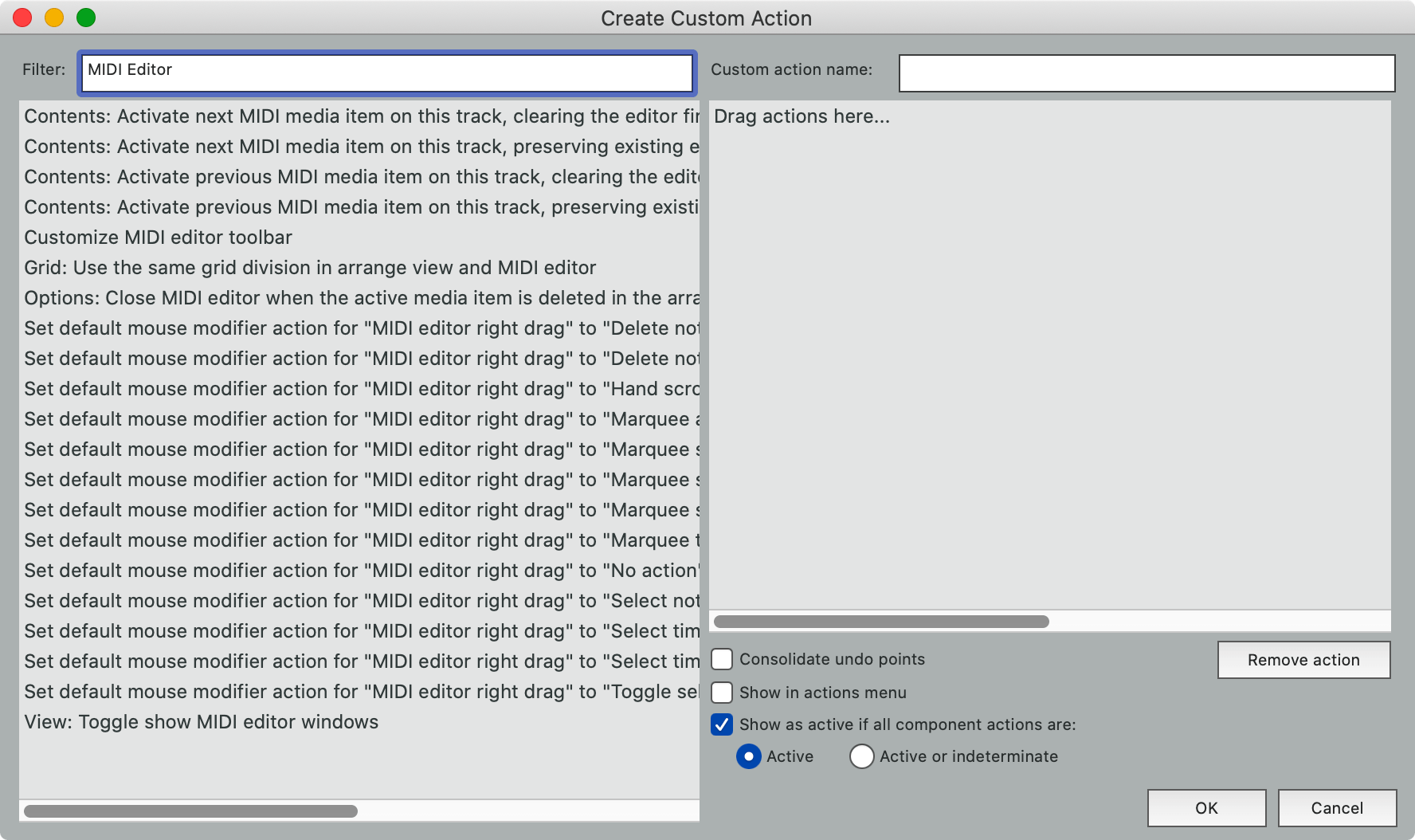
- Open the Actions List (
Shift-/). - Click "New Action" (It's a bit funny to me that there's no action for "New Action" :) ).
- In the "Filter" search box, find "MIDI Editor".
- Click "View: Toggle/Show MIDI Editor Windows"
- Dr... wait. Ugh.
TOGGLE.
That means if I go from Mix->Record, there would be no MIDI editor in the Mix screenset and it would be turned on in my Recording Screenset. Gross.
REAPER does not appear to have a "Close MIDI Editor" action. Hopefully someone will correct me, but until then...
It's time to get clever and write our first script!
Record Screenset Script
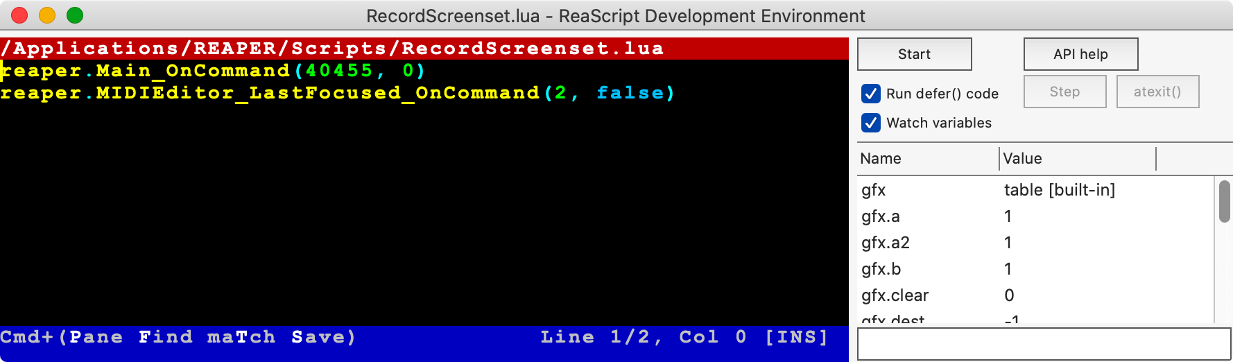
I need to close the MIDI editor, but the "Close Window" command works on what's focused. How can I send that command to just the MIDI Editor window?
First thing is to go to help->ReaScript documentation and search around until I found "MIDIEditor_LastFocused_OnCommand"[^bird]. That function allows me to send a command to the last focused MIDI Editor, and since I only have one...
- Open the Actions List (
Shift-/). - Search for "screenset"
- Right click on "Screenset: Load window set #02"
- Select "Copy selection action command ID"
- Save that somewhere.
- Set the "section" in the upper right to "MIDI"
- Search for "close MIDI editor"
- Right click on "File: Close window"
- Select "Copy selectiond action command ID"
- Save that somewhere.
- Click "New Action"
- Click "New ReaScript"
- Give it a name, like "LoadRecordScreenset"
In the ReaScript we want to switch to Screenset #2 and then close the MIDI editor. That looks like this:
reaper.Main_OnCommand(40455, 0)
reaper.MIDIEditor_LastFocused_OnCommand(2, false)
reaper. precedes the functions so that REAPER understands we're calling its functions and not something of our own making. The 0 in the first commands says that we're sending no other information, and false tells it that we're not a "listviewcommand".
- Hit
ctrl-s(Windows/Linux) orcmd-s(macOS). - Close the script editor.
- Open the Actions List (
Shift-/). - Find your "LoadRecordScreenset" or whatever you called it.
- Assign it the hotkey that your screenset was previously using,
F4for me.
Now when I open my "Record" screenset, the MIDI Editor window will always close.
Fin. [^almost]
[^bird]: In reality, someone on my Discord chat server reminded me of this function. Thank you! Go there and ping @BirdBird. Do it a lot, he loves when you ping. [^almost]: My Mixer and Editing screensets have the same issue, but luckily I'm using the bottom docker there, so the MIDI editor tab simply ends up hidden as an inactive tab.
Work, work.
That was a lot of effort just to make REAPER behave in a sensible way, and I'm not even convinced that this isn't caused by some subtle way I setup my Screesets or MIDI Editor settings!
However, in no other major DAW could we solve this problem on our own in such a straightforward way.
You win some, you lose some.
Appearance
Track Control Panel
I like to see the following items in my track control panel:
- Input selection
- A button to access effects
- A level meter
- Record button
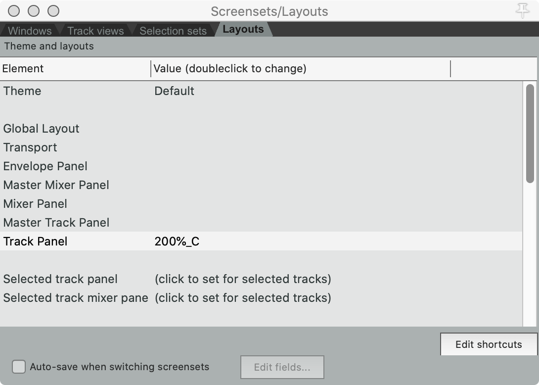
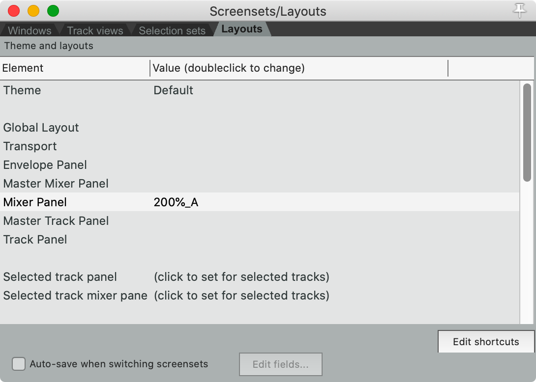
I can get these (and a few extras) by going to View->Screensets/Layouts->Layouts and selecting "200%_C" for Track Panel.
This setting does not save globally, so I must go back to the Windows tab, load each screenset, set the setting in the Layouts tab, then use my "Save Windowset" action (which is Shift+load key).
I do not add this to my Mixer Screenset.
Mixer Screenset TCP Changes
For my Mixer, I do not care about any TCP Controls, so I set it to "50%_B (DPI-Translated to B)" which gives me the most controls in the smallest space.
Theme Adjustments
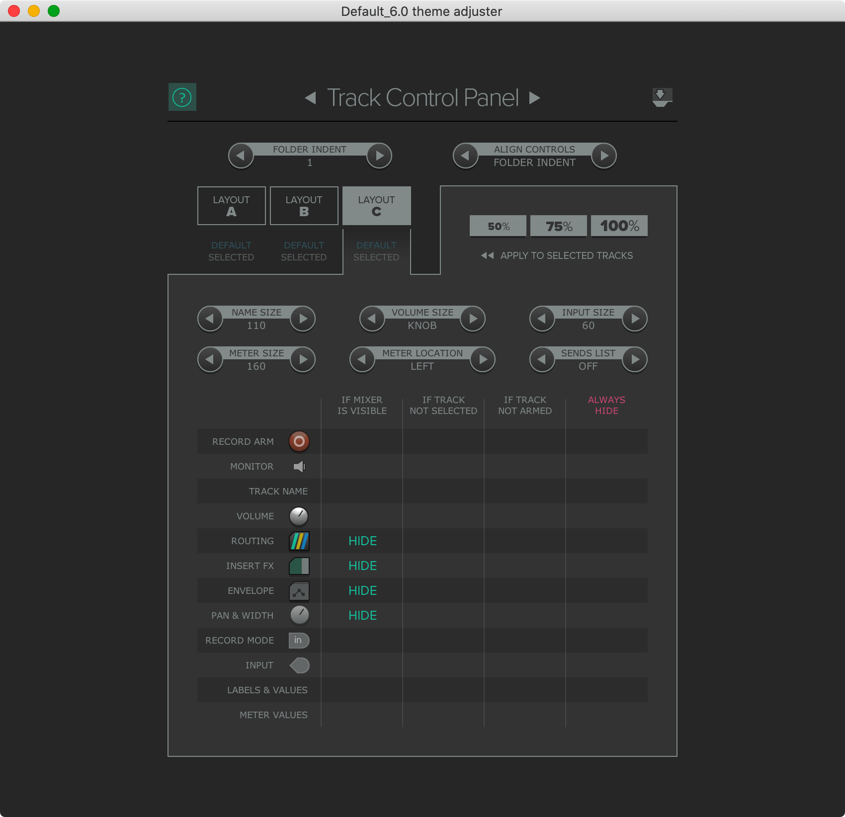
Options->Theme->Theme adjuster/color controls->Layout C
I dislike when controls hide if there's sufficient space for them. There's a fine line between visual clutter and requiring the user to interact with a specific element to get common information.
I don't mind the TCP changing when the Mixer is up since I never look at the TCP. I leave the "If mixer is visble" controls at their defaults.
- Track Control Panel:
- "If track not Armed
- CLEAR - Monitor
- CLEAR - Record Mode
- "If track not selected"
- CLEAR - Labels & Values
- "If track not Armed
Mixer Control Panel
For the Mixer Panel I want the following controls:
- A LONG fader
- Pan/Balance knob
- Solo
- Mute
- Routing access
- Send levels, about 4.
- A list of effects, about 4.
I can get these (and a few extras) by going to View->Screensets/Layouts->Layouts and selecting "200%_A" for Mixer Panel, and this allows me to apply some changes in the Theme Adjuster.
Then I need to change the track height, which I do by creating a track then grabbing the bar just below the sends. Then I delete the track and make a new one to... UGH. The fader height (or effects/send height if you want to view it that way) doesn't save.
Annoying.
You can select multiple tracks then hold alt or option while dragging the height. That will set them all to the same size, but I don't know of any way to have new tracks create with the appropriate height without editing the theme.
Theme Adjustments
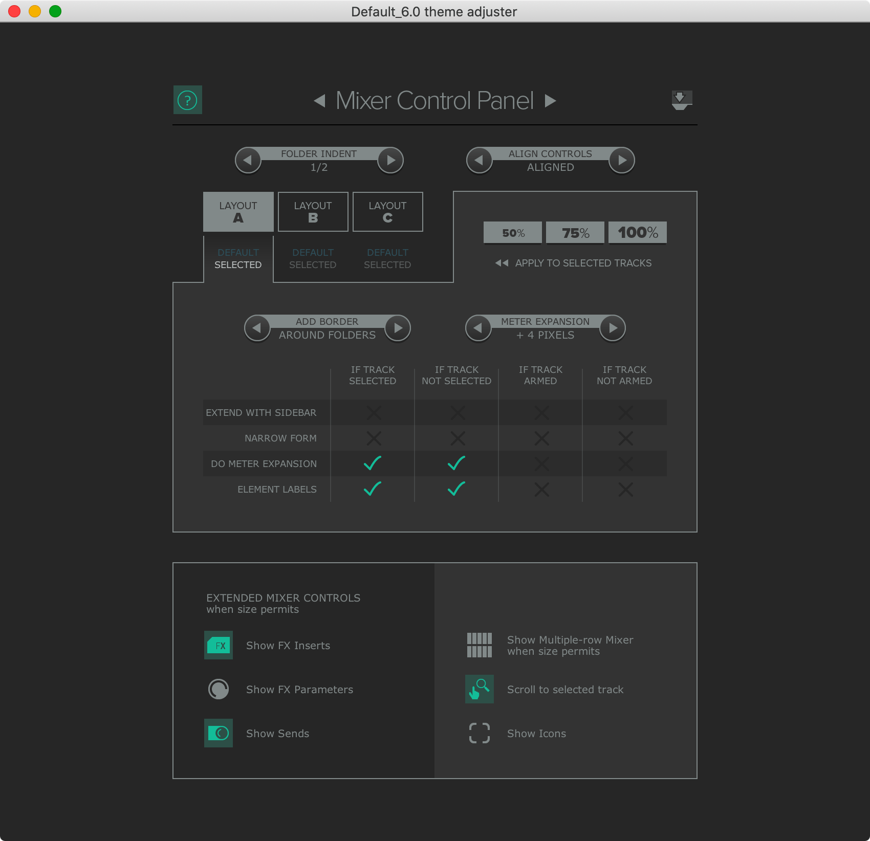
Options->Theme->Theme adjuster/color controls->Layout A
Folders can be difficult to identify in the Mixer, so I like a strong visual indicator of the Parent->Child relationships.
- AROUND FOLDERS - "Add border"
Preference Changes
Undo
Rationale
Undo settings are in Preferences->General
- Disk space and memory are cheap. Ideas are not. I setup my REAPER undo so that I have maximum chance of recovering from failures.
- Selection Undo. The ability to undo selections is a major part of reproducible editing sequences, not because of the sequence but because of mistakes that might happen during the sequence. Most users will probably find these settings irritating, but I treat selection operations as part of the commands that operation on these selections, therefore I prefer them undoable.
- What happens if I somehow reach the point where no more of the undo stack can be saved? Should I value the oldest states, or the most recent states? I use undo as a rewind button, not a history button. I want a linear sequence of state that extends from my recent action to as far as possible. 100 steps ago is meaningless if I cant reach back 1 step.
- I believe offline history is integral to any software with an undo stack. I do not want to close my software (intentional or not) and re-open it without my undo stack in place. My ideas are fluid and persist across instantiations of the application, so my ability to rewind in history should follow suit.
- Undo trees are a difficult topic for me. This is a feature which allows you to store multiple undo paths: I do thing A2, undo twice, do thing B1. In linear undo stacks, it's not possible to get back to A2 because you rewound and rewrote history. Tree-like undo stacks retain this history.
- I turned on "Store multiple redo paths..." for years because I feared that losing history would be disasterous in some fabricated scenario that I never encountered. Despite recognizing that I never used it to heroic effect, the amount of ram used by this feature is minimal when I use REAPER (despite the warning in the dialog!). Ram is cheap, so I store multiple redo paths.
Settings
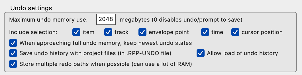
- General
- Maximum undo memory use: 2048
- ON Include Selection:
- ON - item
- ON - track
- ON - envelope point
- ON - time
- ON - cursor position
- ON - When approaching full undo memory, keep newest undo states
- ON - Save undo history with project files (in RPP-UNDO file)
- ON - Allow load of undo history
- ON - Store multiple redo paths when possible (can use a lot of RAM)
Startup
Startup settings are in Preferences->General
Rationale
- I spend more time sketching these days than anything. An idea pops into my head, and I want to record it quickly and save it for later evaluation (when I can be a bit more "objective"). Having a new project of my default template gives me the fastest entry point to the most common task I have in mind when I start REAPER.
- I don't need to be reminded of new versions, and I especially don't want another dialog to click nearly everytime I start REAPER! REAPER's update speed is tremendous, and outside of this series, I update only when there's a feature I care for. Having this setting on puts a dialog between me and startup nearly everytime I open the program.
- I don't know. I turn this off because I don't open media from finder.
- Turning the splash screen OFF speeds up REAPER's start up fairly significantly for me.
Settings
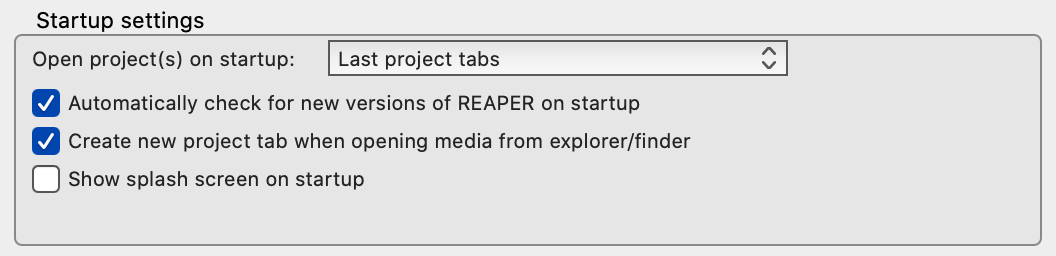
- NEW PROJECT - Open project(s) on startup:
- OFF - Automatically check for new versions of REAPER on startup
- OFF -Create new project tab when opening media from explorer/finder
- OFF - Show splash screen on startup.
Paths
Paths settings are in Preferences->General->Paths
~ in a path means "User directory" on macOS and Linux.
Rationale
- I set this to my
~/Music/Reaperdirectory so that all REAPER based projects end up in the same place. I generally remember which projects are in which DAW, so this is easier for me. - Left empty so that all assets are stored with the project. This makes the project portable.
- I like to sketch things out in an empty project sometimes, so I set this to
~/Music/Reaper/Sketches. If not set, then everything goes into~/Documents/Reaper Media - I HATE reapeaks. I would be quite happy if there was an "always compute peaks and never, ever, in any circumstance, create reapeak files". I put them in
~/Music/Reaper/Garbage - No idea what this does, and I don't care right now.
Settings
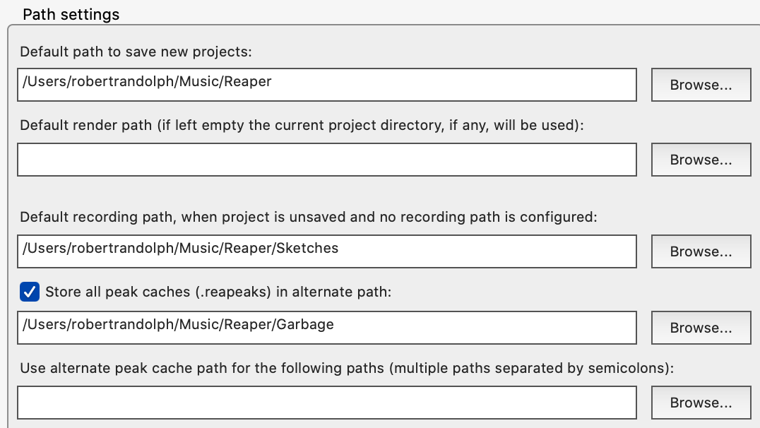
~/Music/Reaper- Default path to save new projects:- EMPTY- Default render path (if left empty the current project directory, if any, will be used):
~/Music/Reaper/Sketches- Default recording path, when project is unsaved and no recording path is configured:- ON - Store all peak caches (.reapacks) in alternate path:
~/Music/Reaper/Garbage
- EMPTY - Use alternate peak cache path for the following paths (multiple paths separated by semicolons):
Buffering
Buffering settings are in Preferences->Audio->Buffering
Rationale
I have a fast computer, I dislike latency of any sort, even at the expense of performance. That includes live-monitoring latency and latency of controls.
I also use a UA Apollo and UAD plugins which do not work with anticipative processing very well.
Settings
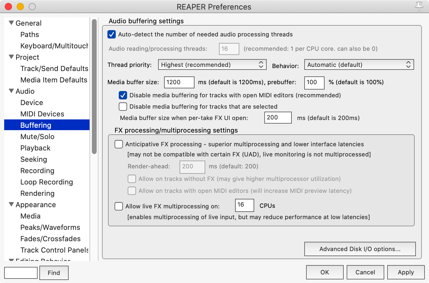
-
ON - Auto-detect the number of needed audio processing threads.
-
Highest - Thread priority
-
Automatic - Behavior
-
150ms - Media buffer size
- 100% - prebuffer
-
ON - Disable media buffering for tracks with open MIDI editors
-
OFF - Disable media buffering for tracks that are selected
-
50 - Media buffer size when per-take FX UI open
-
OFF - Anticipative FX Processing
-
OFF - Allow live FX multiprocessing
Loop Recording
Buffering settings are in Preferences->Audio->Loop Recording
Rationale
I loop record frequently, and the default settings are silly. Almost every other DAW discards takes if not completed, since most users don't want slivers of guitar noise while they reach for the stop button. Neither do I.
I prefer safety when recording as well. REAPER defaults to writing files after the entire looping process is finished. This makes recovery from a crash or mistake difficult (or impossible)
As of this writing, this dialog appears to use "Full" and "Complete" to mean the same thing, even though you can change the meaning of "Complete" to <100%. I think that most users will view the word "Full" as always meaning 100%. This is confusing.
Settings
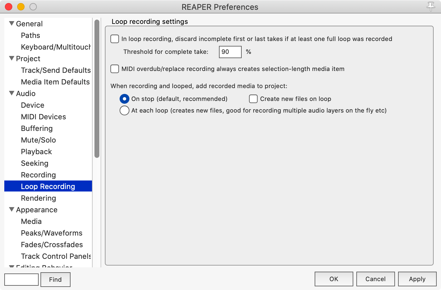
- ON - In loop recording, discard incomplete first or last takes if at least one full loop was recorded
- 100% - Threshold for complete take:
- OFF - MIDI overdub/replace recording always creates selection-length media item
- When recording and looped, add recorded media to project:
- ON - At each loop (creates new files, good for recording multiple audio layers on the fly etc)
Conclusion
It might seem like I've spent more time writing about REAPER than using it due to all this ranting and a few sections about settings.
To the contrary, I've spent quite a bit of time using REAPER as vanilla as possible and trying to understand the bare minimum number of things that I can change. This has been painful as I expected. REAPER has some of the strangest defaults, and I struggle to understand most of them as anything more than "What will keep support emails down."
As usual, I'll be excited to receive corrections or suggestions from my awesome readers.
Meta
This post took:
- 22 hours to write and figure out various REAPER settings.
Other parts in this series
If you appreciate the information presented then please consider joining Patreon or donating money/time.