July 4th was my last day of of using Bitwig via the ‘30 days’ monicker.
I’ve made my decision on whether I’m going to continue with it or fall back to Renoise.
Let’s see what I’ve decided and why…
Other posts in this series:
- Bitwig first impressions
- Bitwig feature review - Note Expression
- Bitwig Modulators - The coolest part of Bitwig
- Bitwig Effects review
- Bitwig Instruments, Note Effects and Instrument Containers Review
- Things that Bitwig could improve.
- Bitwig Review, but better!
Contents
Choice - Uninstall
No, I will not be continuing to use Bitwig.
Reason
There is no doubt that Bitwig is a fantastic product for a lot of people. However, I’m personally let down largely by the poor note editing, slow browser and overall responsiveness.
To me these are the 3 core areas of productivity and Bitwig has yet to refine them in any meaningful way.
Editing

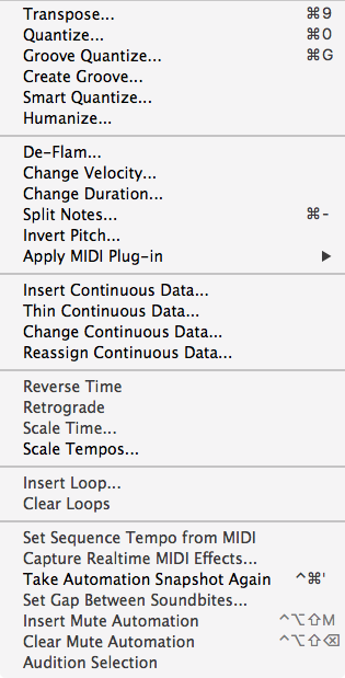
Bitwig’s primary method of working is to present it with some data, then manipulation of the data in Realtime. The Modulators and Note Effects are clear evidence of this. The lack of destructive editing tools, like in the above pictured dialog, bear damning evidence to this.
Even Bitwig’s basic note input is flawed in fundamental ways. Setting note-lengths is a pain, multi-track editing is difficult to use, there’s no actual drum editor, no notation, no quick way to investigate note values on a macro scale (event list), step entry, destructive note effects application, view filters, manual phase stretching, etc…
It’s about as basic as you can get. You can enter notes manually, or record them. The notes can be copy/paste/duplicated, lengthened and moved. That’s it.
Even trying to do automation in Bitwig is more work than elsewhere. For most workflows outside of Bitwig automation corresponds directly to the sounds occurring, and the occurring sounds are mostly correlated to the notes played. There is no recognition of this linkage in Bitwig. Automation/CC seems like an afterthought, it’s just a way to draw in movement. The design is an extension of the ‘manipulate data’ paradigm in Bitwig, rather than as an integral part of the note data itself.

Yes there is the note-inspector, but it’s largely a gimmick and a bit of a workflow killer to constantly interact with it. Having to dart your eyes and mouse around to interact with the inspector is not good.
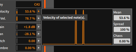
The graph display for humanizing multiple selected notes is clever. It’s limited, it’s hidden, but it’s clever. It also doesn’t work very well if you’re trying to do any sort of intelligent humanization or randomization.
Want to just shift randomize note-starts a few ticks biased in the same direction? That’s a bit of a chore actually, even if it’s a very basic method of adding some feel to a performance.
Add some chaos to vary? Great, but it gets ruined if you hit any limits when adjusting mean/spread. Vary the mean then add chaos? Want to undo the chaos? Nope, it undoes everything. I could go on actually. It’s a poorly-thought out gimmick that will ‘Wow!’ Live users and basically nobody else.
Browser

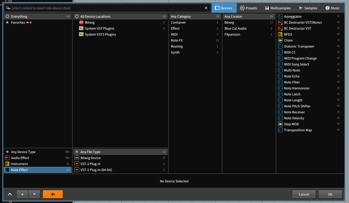
Bitwig’s browser tries to do too much, and like much of the program, overlooks really basic things.
Yes, it is better than Ableton Live’s browser. I don’t care. I don’t use Live anymore, and the browser was definitely one of those reasons.
I covered a lot of this before. Since then I’ve realized that I also quite dislike how everything is tried to be presented in a single window with some sort of category pre-selection. Rarely does Bitwig ever pull up the right category for what I want so I end up having to click around to find things. Searching is awful. The ‘Category’ panel is useless in any pane it appears. Smart Collections are dumb. The Preset browser is almost totally useless because it’s missing so much. The sample browser is ruined by the ultra-basic search code. The sample browser is tedious to setup and requires you use only your OS’s basic file dialog to find locations. The sample browser doesn’t handle missing drives elegantly. There is no file browser in the browser.
If, at the very least, Bitwig’s browser had these basic features I would perhaps find it useful:
- Fuzzy Search - searching for ‘verb’ should find ‘reverb’, but searching ‘vrb’ should too.
- A real file browser - The side-browser has a file-dialog, but it’s cramped and doesn’t even have basic location favorites or search! In the pop-up browser, having to setup all your sample locations through a ‘file dialog’ is painful. Even after setting all that up, you’re still put in the place of browsing like a file browser because the search is so awful. Just give us a normal file browser with favorites and good search. Bitwig doesn’t need to scan the whole directory and categorize everything, just let me see what’s on my hard drive with a decent file browser!
- Search history - There’s so many times where I search for something, then within a short time period I want to search for it again. There should be an easy way to pull up the last search/location, or have the last location be the default when the browser is pulled up for samples. (optionally via some modifier key)
- User modification of device categorization - Yes you can setup favorites, but then I have to remember what was a favorite or not. I want my ‘Rob Papen’ and ‘RCPX’ manufacturer devices in the same folder. I don’t want to have to remember that they are in a favorite folder everytime. I also should be able to tag devices with my own categories. The categorization panel is basically useless otherwise.
- Project search - Let me search for things already in the project.
- To select - firstly allow project search to selection so I can select any given samples/notes/devices/whatever and do what I want with them. I need note-search to selection at minimum. Being able to quickly replace all X samples with Y sample via the browser would be great too.
- To re-use - Often if I’m using an EQ in a project, there’s a very high chance that I’m going to use that same EQ again. Make this easy.
There’s plenty more that could be done, but Bitwig’s browser system really needs work.
Responsiveness
No image here.
Bitwig’s just feels slow and sluggish. The metering looks great, the project display scrolls nicely and the controls move great. Things like inserting devices, moving notes, switching views, opening favorites folders, alt-tabbing to Bitwig and other simple things are often choppy or sluggish. Sample indexing is also a very frustrating process when a file-browser would suffice.
Bitwig nearly has it here, but the slowdowns and choppiness make the otherwise smooth GUI a jarring experience rather than a pleasant one.
Maybe it’s my system, but no other DAW that I use has this issue. Particularly in contrast to the consistently fast and smooth experience in Renoise.
EDIT August 18th, 2018 This is improved. Responsiveness is quick for me now.
Conclusion
There’s a number of features I never really got to experience or cover. The inline session view, the controller-api, the detail editor, studio I/O (which isn’t even worth covering since it’s so limited), the weird and ultimately useless menu-pinning system, project panel (which is great for collab!), etc… I just spent so much time being annoyed by the basic experience of working with music.
Bitwig has a lot of neat stuff, but in my experience it’s just tacked on features to mask a core-deficiency.
Go open Bitwig and try to make a track without modulators or note expression. If you’re used to any other DAW (except maybe Live), then it’s going to be painful. The basic experience of just making music in Bitwig is flawed. I have 30 year old hardware sequencers that have a significantly more complete system for working with midi-based music. It’s 2017 Bitwig, why could I do step entry back in 1985 but I can’t even select the note length in your software?!?!
I have no doubt that there’s a huge population of people that find value in Bitwig for what it offers. The concept of re-forming a small set of data to create music isn’t new, and it is a valuable idea, but it’s not how I work. I want to write music, not sculpt sounds.
Bitwig isn’t for me.
Well, it is kinda. Check out that update to see what has, and hasn’t changed.
Support Me!
This post took 2 hours to research, photograph, write and edit. If you appreciate the information presented then please consider joining patreon or donating!
