Reaper Day 30 - An evaluation and conclusion
The REAPER series has ended. The end of this series is somewhat unexciting, but it was a lot of work for me.
The result is The REAPER Settings Page. A list of all of my changed REAPER settings, with explanations of why I made the change.
Jump through to see some of my discussion about REAPER in general.
Currently using REAPER 6.23
- 30 days of Starting over with REAPER
- Rants and GUI Tweaks (again)
- Designing MIDI commands
- MIDI Command Inventory
- Item Editing Design and Inventory
- Project Template, Preferences and Mouse Modifiers
- Hotkeys, again! ...?
- Look Ma! No Hands
- An evaluation and conclusion
Contents
REAPER Settings
A list of all of my changed REAPER settings, with explanations of why I made the change. I will keep this updated as/when I use REAPER.
Notable Standouts this round
The good
Actions List
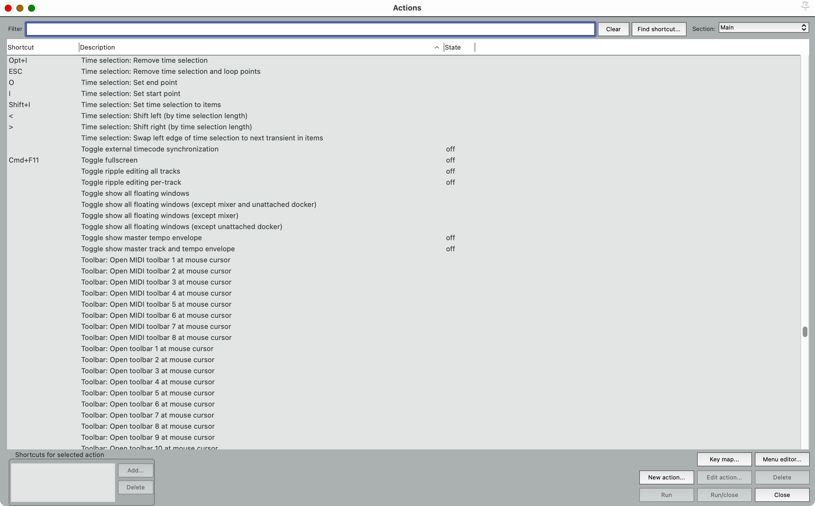
It is possible to find nearly every single REAPER command, or setting, that exists.
Unsure of how to do something? Pop up the action list and start searching, it’s likely that you’ll find what your way quickly.
Searchable preferences
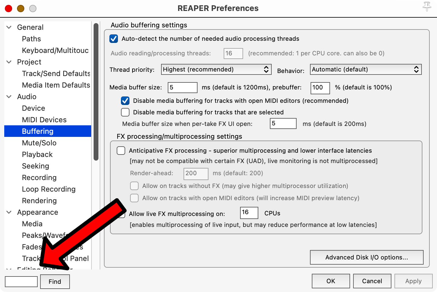
REAPER has a lot of options. I wish every DAW had this, even the ones with few options!
The only downside is that it searches exactly for the text in the dialog. There’s no documentation or metadata that’s searched, so you might have to try a few different terms to find what you need.
Item FX
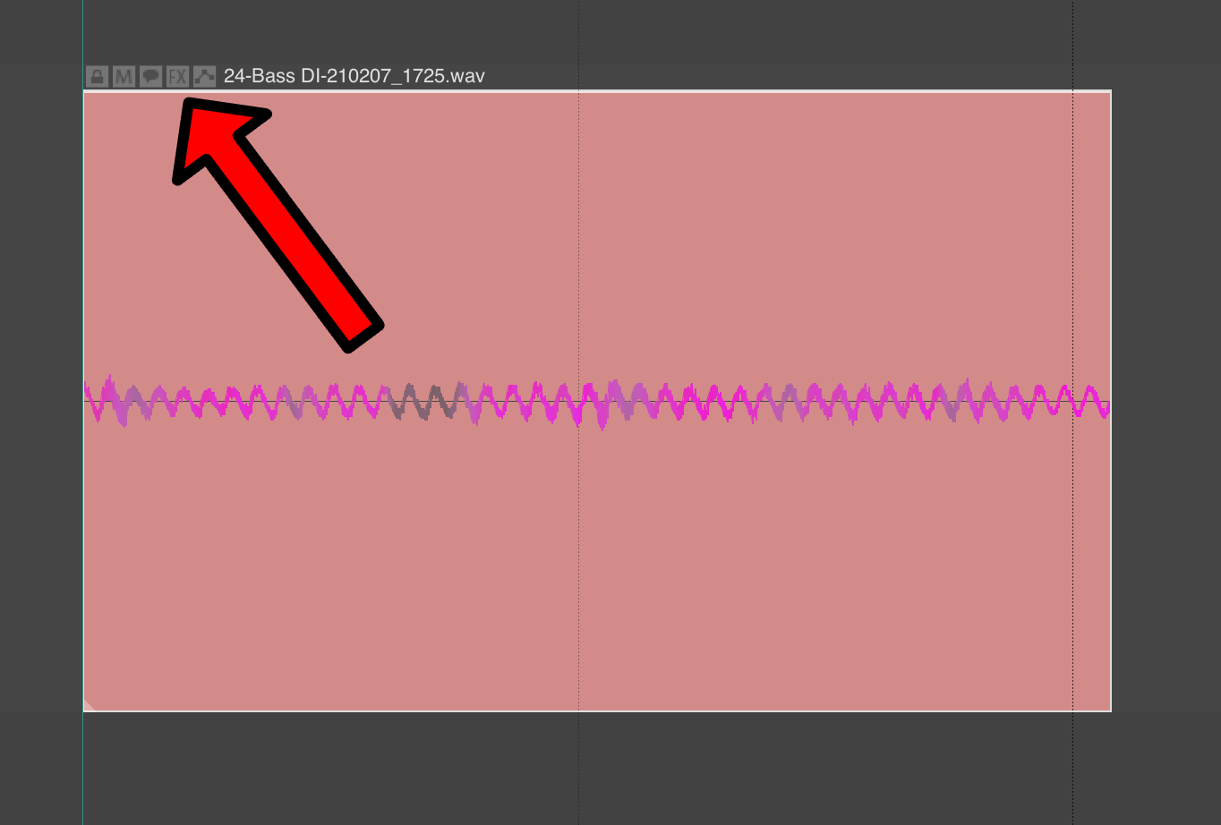
Every item has its own FX chain. Complex FX chains with parallel paths.
Track Manager
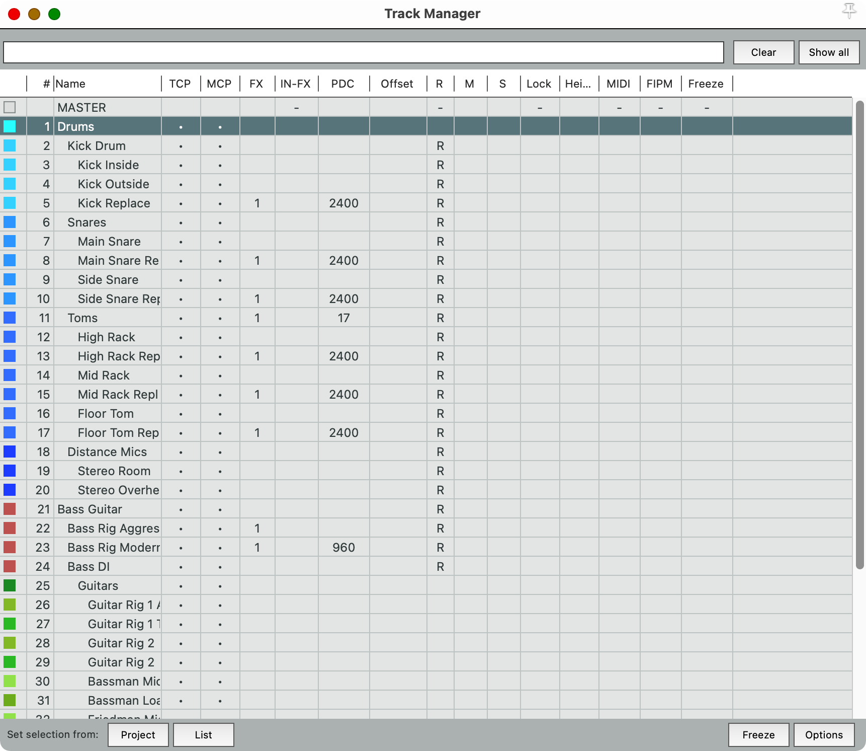
Track Search, track filtering and quick access to common track features.
The bad
No Searchable Routing???
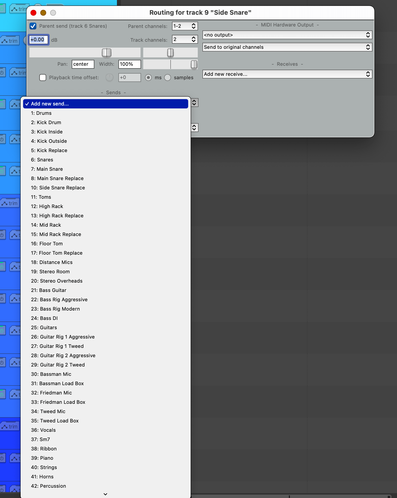
Why is this bad do you ask? Because it is the most immediate way to find destinations, or sources, for your routing needs. Locating what you need is absolute mess.
You can use the Routing Matrix, which is just a giant grid, good luck navigating that in a 100+ track project!
Routing things in REAPER is vomit-inducing. The simple act of creating a typical ‘aux send’ and assigning a track can take upwards of 10 actions in a large project, or you search for a script to help you. Total nonsense.
More likely is that you go find a script.
Track Wiring
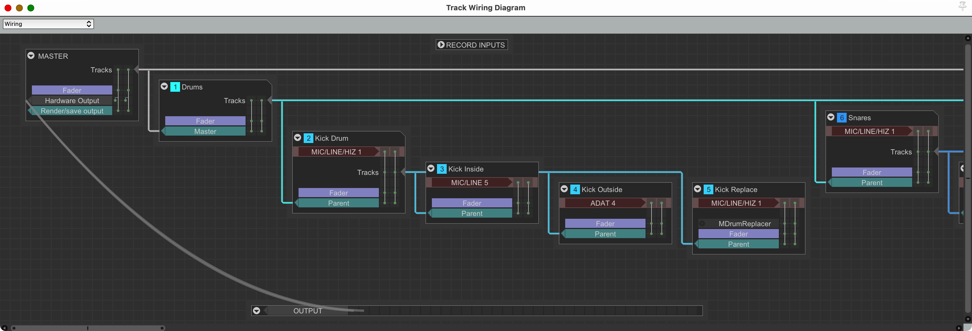
The Track Wiring view (modular graphical view of routing) would be incredible, except everything is displayed horizontally, arrangement of nodes does not have an undo stack, and it’s not searchable. It’s effectively useless.
Look at that picture and tell me how useful that is. Use it and you’ll realize how broken the UX is.
Takes
The takes system is broken in a number of ways, and most people seem to dislike it.
ESPECIALLY ME
MIDI
MIDI editing in REAPER is just strange. It feels like a different program that just happens to be embedded in REAPER.
- Various actions have different names than their functional-dopplegangers in REAPER.
- Modifiers do different things by default.
- There’s 3 different ways for the MIDI editor to interact with items.
- There’s 4 different MIDI editors, all with different interactive designs.
Considerable effort was spent adding a Notation editor, and out of the 100s of REAPER power-users that I know, I don’t know anyone that prefers it (and only a handful that even try to use it!)
Most heavy MIDI users rely on a variety of scripts to do tasks that are integrated into other DAWs.
There are people who are fanatical about the MIDI workflow in other DAWs (Logic and DP have some vocal supporters), but I know of not a single ‘power user’ that uses the REAPER MIDI editor as is.
The weird
- Free Item Positioning - you can place item anywhere inside of the track’s view, every track is effectively its own little mini-DAW. I’m always fascinated by this feature and have yet to find a use for it.
- Scripting - REAPER has quite possibly the most comprehensive scripting capabilities of any DAW, however it has minimal documentation, glaring holes in interoperability and no graphical interface toolkit.
- API - The REAPER API is in a similar place. You can write ‘external’ programs that interact with REAPER, but there is little documentation other than reading other people’s code, which is sometimes a ‘best guess’ to begin with.
- Folders - Every “folder” in REAPER also creates a signal routing path, or a “bus”. Not every hierarchical relationship is a folder though, and it’s possible to accidentally create signal routing paths that seem to work like the folder tracks, but don’t (or interfere with their behaviour).
- It doesn’t help that folder routing is not undoable either??
Conclusion
I spent a lot of time using REAPER for this series, and most of it was fiddling with settings and hotkeys. Often it was not because I needed to, but because I could. Therein lies REAPER’s greatest weakness: you can.
It’s possible to shoot yourself in the foot, pull the bullet out, stick it in your mouth and choke on it.
There are features that are poorly designed that are overlooked for a variety of reasons, not the least of which is that some scripter has made something that sort works better. In fact, theres a few dozen scripts for REAPER that exceed REAPER’s capabilities and those of other DAWs. The user experience of these scripts is usually lacking for practically every reason a UX can suffer, but it’s better than REAPER’s default, so it’s voraciously devoured.
If you run into a problem there’s 100s of settings to try, and most of them come with zero official documentation.
Some actions have a dozen or more slight variations. Want to map a hotkey, well… that might take you an hour or so.
Want to do something simple like record into the DAW? There’s only… 16 modes of record.
REAPER is plagued by a seemingly unending onslaught of options, and that is its strength. There’s workflows (dialogue, sample editing, SFX design etc…) that can be optimized to extremes due to REAPER’s flexibilities. It’s possible to write a script that takes an 8 hour manual task in Pro Tools into a single button press in REAPER.
The downside is that many of built-in features are half-baked. I am not the only REAPER user that feels like every major feature in REAPER was released not because the devs met their goals, but instead because they became tired of fussing with it or simply bored of it. Notation. MIDI editor. Track Wiring. Takes. Spectral Peaks. Metronome. Automation Items. 6.0 Theme system. API.
All of these major features were released without anything (publicly) resembling a roadmap, design, goals or an outline of what problems were being solved. I do believe that these things exist in some form in private, but the output of the work does not indicate their existence. You can look at another DAW’s release and see very clearly what problems they were trying to solve, their goals, and that someone was in the background aggressively trimming out anything that didn’t meet that specification. REAPER features come out like a rock-salt shotgun blast. There’s an initial blast and when you look down there’s a seemingly arbitrary pattern of small bits that form the feature.
That shotgun-like approach to features/bug-fixes is a boon to people with niche workflows. Every REAPER release is filled with bug fixes and small additions that remove blocks to specific workflows. Very few REAPER releases come with a targeted and opinionated introduction or revamp of a feature.
If you know exactly how you want to work, then REAPER is incredible. You can build your workflow and craft the DAW experience of your dreams (though your dreams will become warped along the way!).
If you don’t want to think about how you work, then REAPER will fight you every step of the way.
What about me? I somehow made it so that I can’t get a right-click menu for items anymore. Bleh. I’m done… for now.
Meta
This post took:
- 5 hours to write
- 19 hours to combine, verify, modify and edit the REAPER settings page
P.S.
Preferences->Mouse->Mouse Modifiers->Arrange View->right drag->default action Setting this to “Select time” breaks right click menus on items.
The fact that this is possible galls me to the core.
Somehow this entire experience has made me miss Studio One… If you know me, then the gravity of that statement will hit hard.