A while ago I wrote a bit of an article about what I hated in Digital Performer. (I have updated that post as well!)
Well, Digital Performer 10 is out!.
I had a bunch of prepared content for DP10, but it appears that other press, including MOTU, managed to cover the same topics I was going to. I hate duplicating content and I avoid it if possible. I sorted those posts away. THIS IS NOT A THOROUGH REVIEW. It’s just the things I like about the update.
Let me walk you through what I like about DP 10, and why I’m back to using DP10 as my main driver. (I switched to Cubase in Aug 28, 2018 while waiting for DP10 if you don’t remember.)
- Cool Features in Digital Performer... Part 1
- Cool Features in Digital Performer... Part 2
- Cool Features in Digital Performer... Part 3
- Cool Features in Digital Performer... Part 4
- Cool Features in Digital Performer... Part 5
- Things I hate about Digital Performer...
- Things I don't hate about Digital Performer: 10 edition
Contents
Big Hits
Nearly 100 bug fixes
This isn’t the sort of thing that MOTU advertises very well, but by my account there’s nearly 100 bug fixes over DP9.5.
Most importantly, the Windows version is finally usable I think. Version 8 was awful. 9 was hit or miss. Version 10 has been excellent, minus some GUI weirdness on occasion.
Spotlight - sorta
If you’re not a macOS user, then may not know the beauty of spotlight (or Alfred!, which is what I use). Windows search is terrible in comparison.
The idea is that you press a key combo and then have a ‘global search’ of sorts. DP10 has that now.
Shift-Space and now you can quickly find any command you need. No more assigning arcane shortcuts that you’ll never remember, or searching the menus for 30 seconds to find that one quick thing.
DP has solved this better than any other DAW by just “borrowing” a perfectly working concept from their original platform.
It’s brilliant.
If you watched my video about radial menus then you may be surprised that I prefer DP10’s system over radial menus.
The concept is similar, but instead of mentally mapping location to a command, you can just utilize the spelling of the command itself. Even if you forget where it is, you can remember it. Eventually you’ll learn some quick nonsensical shortcuts like mo i to find ‘Move Insertion Point Left’.
The downside is that it doesn’t have smart fuzzy searching. If you wanted to search for “Quantize Note”, you can’t type QN. I wish Motu would improve that.
VCAs
I already explained VCAs in DP10.
I love this feature, and it’s the #1 reason I’m not going to spoil the conclusion
Absolute Snapping
This is one of my favorite features.
Previously Digital Performer would only allow you to move a note or a soundbite (region/clip/item) by the amount set in the group. If you wanted to move a note to a grid line then were are forced to use the quantize menu, which is not the best of workflows.
In Digital Performer 10, you can now turn off relative snapping so that things that you want to move will move to the grid lines instead of moving by the grid amount.
It’s optional, so if you like the ‘relative’ behaviour you can toggle it on/off at will.
Fixed/Auto
Fixed snapping is when you setup the snapping divisions yourself.
Auto is when you allow DP to decide what the most reasonable snapping division is based on the current view width. No more zooming in to find out that your snapping division is larger than the view!
Sequence Window beat warping
Let’s not kid ourselves. This is not a revolutionary feature. Other DAWs have had it for a long while, but I think DP does it better… in the main way it matters.
Firstly, ZTX stretching is used instead of Elastique, and I personally prefer ZTX. You can hit that link and choose for yourself! Getting a good sounding result is the #1 thing, and I think that DP nails it.
There are some issues though:
- You can’t drop your own markers when in the Sequence Editor (the main view), or I can’t figure it out. Adding beat markers requires going to the Waveform Editor, switching to “Beats” mode and using the pencil tool. It’s a bit cumbersome, but it does force you to work in a more precise manner than I think many of use would. It’s still bothersome regardless.
- There are limits on how far you can move things. If you like using stretch to make crazy sound effects, then you’re out of luck. For the sane user, this is a nice protection. For the crazy folks (like me!), it’s less fun.
- No multitrack stretching in this manner. You must utilize quantization for multitrack stretching (like on multitracked drums). Currently you can not manually do this.
- I STILL have to dump my tracks out of DP10 most of the time, because I multitrack nearly everything. I rarely record something with just one microphone, and that means that I have to use Pro Tools or Studio One or Reaper instead.
- There is a workaround. It’s the same as this ancient Cubase workaround.
- I STILL have to dump my tracks out of DP10 most of the time, because I multitrack nearly everything. I rarely record something with just one microphone, and that means that I have to use Pro Tools or Studio One or Reaper instead.
VST3 Support
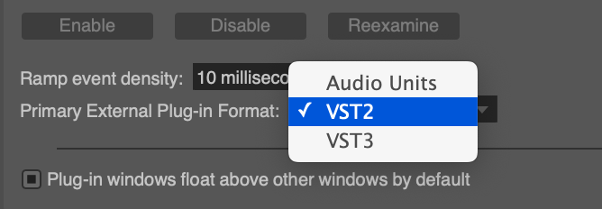
I’d love to have a big section about this, but I haven’t tested if/what VST3 features are supported.
All of my VST3 plugins work though, and that’s A LOT of them.
Quantize and move

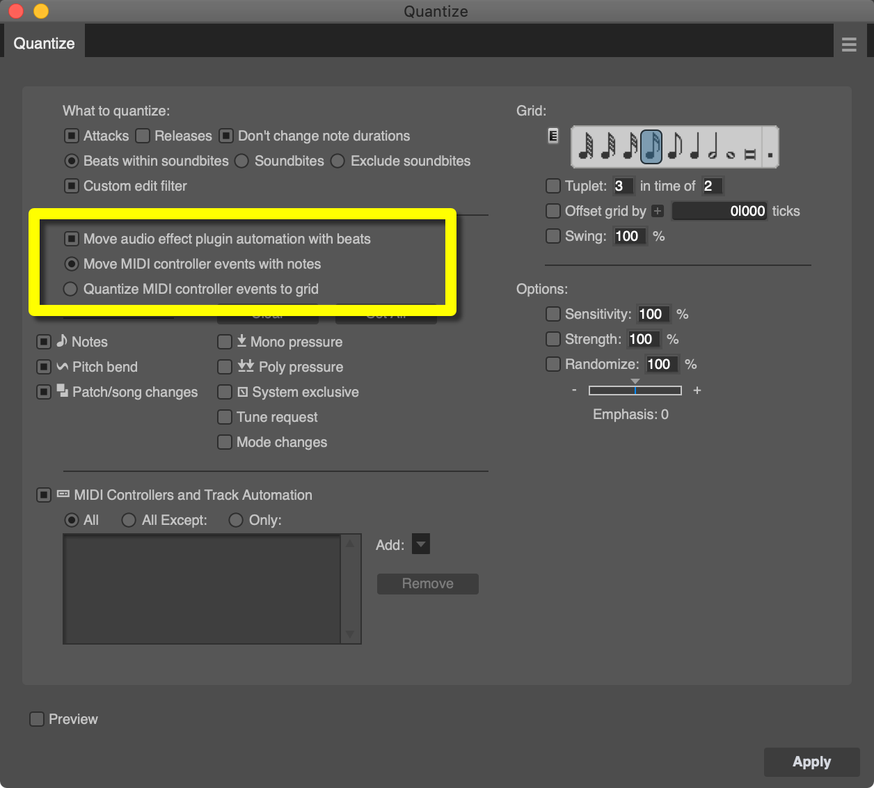
Quantizing soundbites (clips/items/regions) and MIDI data can now optionally move associated data (automation or CC, respectively) with it.
It doesn’t do this naively for MIDI either. Things are stretched between quantization paths, so you end up with something fairly natural instead of just some clump of data moved.
Groove Quantize has this too now.
Excellent feature addition and exceptionally helpful.
MIDI Note Velocity Display
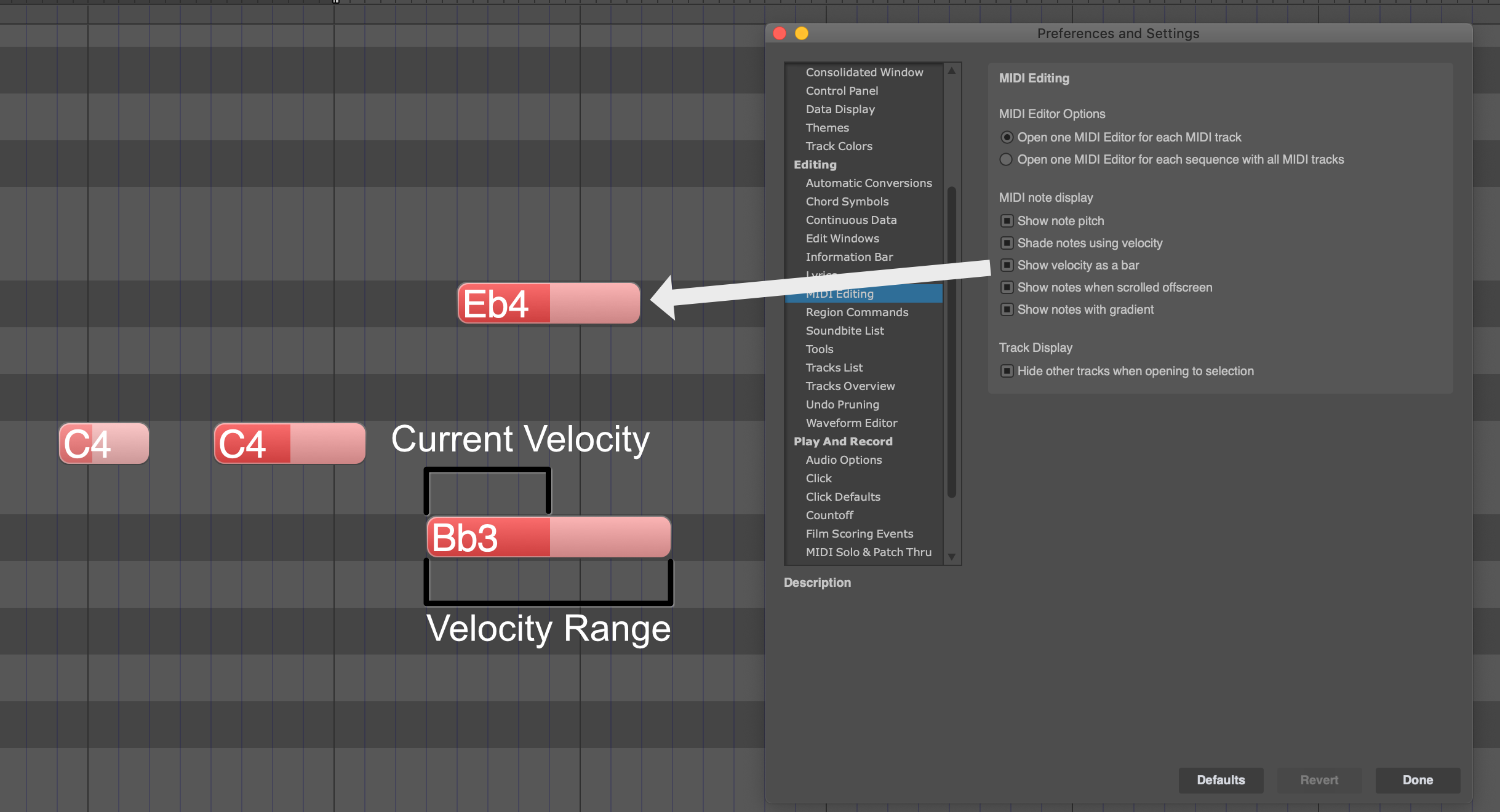
There’s now an option to display velocity as a bar inside notes. A great feature to have when programming MIDI or working with MIDI in general.
Actually changing MIDI velocity in DP is still terrible, but this is a big step in the correct direction.
New MIDI Velocity
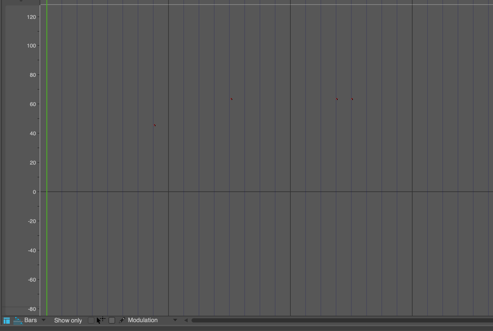
Let’s play a game! It’s called “Spot the Velocity marks”.
I’ve already lost the game.
Even though you can now clearly see velocity as colour, or as a bar in the note, the actual editing space is still terrible to work in. There are ways to make them slightly more visible. That doesn’t help much.
BUT I have a video on a ‘workaround’, that I think actually makes editing MIDI Velocity in DP a pleasant experience. It can be difficult to see what you’re doing, but actually doing it is a breeze!
Adjustable Cue Transport
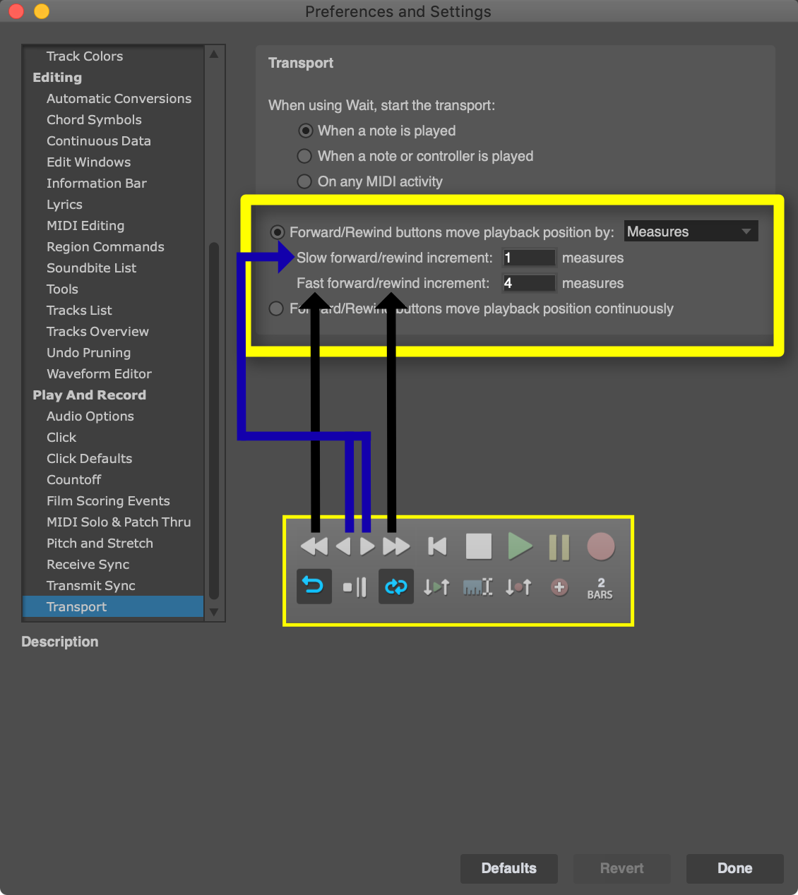
Those little rewind/forward buttons are finally useful! You can configure how far they move, and what measurement they increment in.
This is a feature missing from quite a few products. It’s irritating to zoom in and edit, only to find that you need to mess with a scrollbar to approximate a new location. It just makes temporal navigation in the project much easier.
Region presets
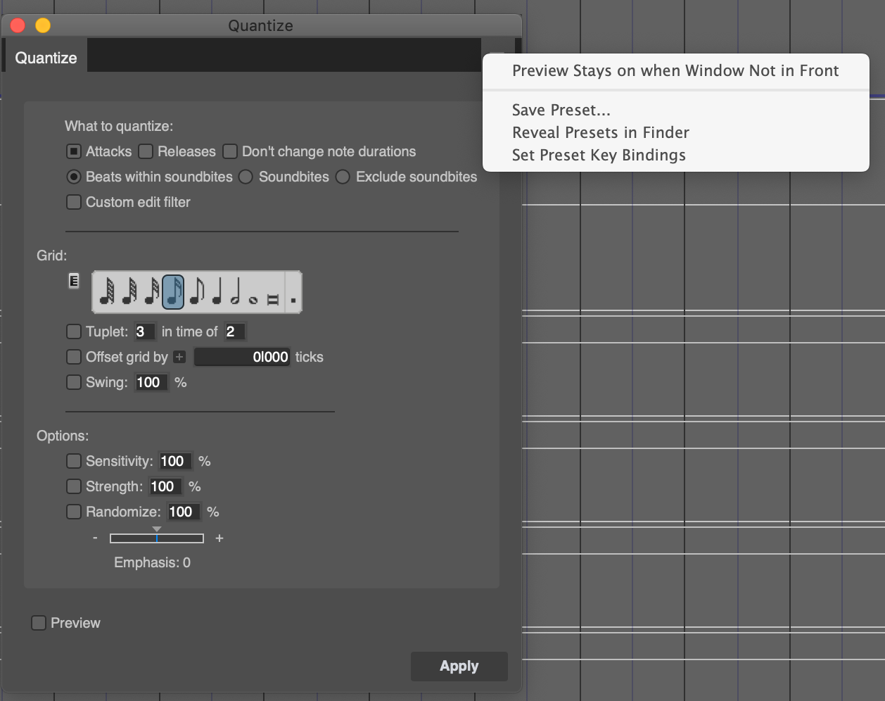
AWESOME.
You can save presets for just about any MIDI transformation:
- Transpose
- Quantize
- Humanize
- De-Flam
- Change Velocity (MIDI Compression)
- Change Duration
- Split Notes (very useful for drum patterns!)
- Invert pitch
- Insert Continuous Data (very useful for drums again!)
- Thin Continuous Data
- Change Continuous Data
- Re-assign Continuous Data
- Insert Loop
- Echo
- Arpeggiator (drum patterns!)
- Transpose (plug-in version)
- Re-assign Continuous Data (plug-in version)
- Remove Duplicates
All of these can have their settings saved and recalled quickly and easily.
The kicker is that you can easily assign a shortcut to a preset. Now any sort of common transformation (or data creation!) can quickly be recalled.
This is a HUGE feature.
Minor things
GUI Scaling
I’ve listed this as a “minor thing”, because I personally think it’s not useful for your average person. When you zoom the GUI to be larger, then you have lost screen real estate. It doesn’t in any way fix the issue of DP having small GUI elements. It makes everything bigger when you may only want some things to be bigger.
That said, I can see it being particularly useful on very large displays. I already use it that way.
It’s still a great feature to have.
Info Box
There’s a nice new info box when dragging a soundbite!
It also follows your time ruler’s measurement format. If you work in frames, then it shows frames. Samples, Time and Bars/Beats as well.
Alternate Tool
Some DAW users will roll their eyes at this thinking “We had this for DECADES!”
DP users get it now. Rejoice. It’s a workflow boon.
Sounds!
There’s 5.5gb of loops and sounds and stuff.
I really don’t care about them, but if you do then I’m certainly not the person to give you an informed opinion about them.
Event List Filter
The Event List now has filters for quick viewing of data.
I LOVE event lists. Editing in the event list is the way to go for precision and persnickety tasks.
Playhead Snapping
Nothing was more annoying in older versions of DP than working with time delineated things (loops, memory markers (timeline loops), quantized MIDI, etc…) and trying to get the playhead to the correct place: right on the beat.
Now it snaps to your current snap preference for any measurement size or division. Much better workflow!
EWWWW, what were you thinking?
Clips Window
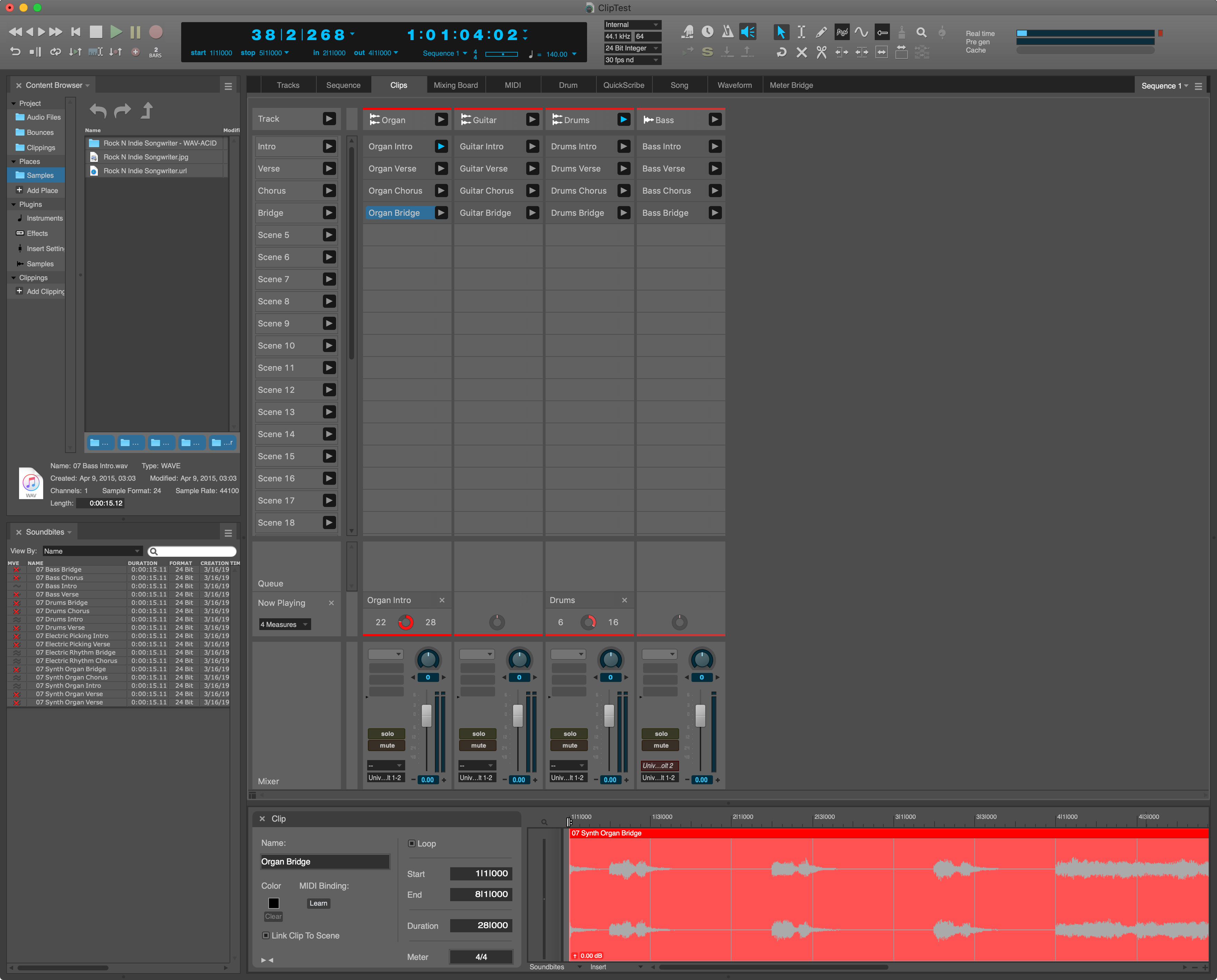
Let’s talk about all the things that you can’t do in the clips window!
- Horizontally resize tracks.
- Sequentially name scenes.
- Easily rename your clips (you have to click at least twice, half way across the screen, to rename something).
- Rename your tracks?.
- Drag in clips quickly. There’s a pause after every clip or so. I have an ultra-fast system and even I have to wait 5+ seconds to drag a clip in sometimes!
- Turn on stretching for a track!!!!!
- In order for things to play in tempo, if you’re utilizing clips of varying tempos, you need to turn on stretching. This is vital to the operation of the Clips window, and you need to switch to another window to do that for each track.
- Select a track.
- Re-arrange scenes.
- Contiguously select files.
- Utilize folder tracks in any way.
- Know if your clip is playing by looking at it.
- Have varying tempo and time signature per scene.
- Mix stereo/audio files
- You will invariably want to put a stereo clip on a “mono track” or vice versa and be utterly confused why you can’t play the track. DP will even animate queueing the clip, but not play it.
- Use the Clips Window without playback.
- If you have any audio in your project at all, it will play back any time you use the Clips Window. So you can’t use the clips window for trying out ideas easily.
- Record audio.
- Record MIDI.
- Record your Clips Window sequences. This is currently a huge missing feature.
- Sequence clip playback.
- There’s no clip follow actions like Live for instance. You can only queue clips in DP. *
- USE THE DARN THING!!!!!!!
- I would say that probably 50% of the time, the clips don’t even make sound for me. DP will show the playback. It will play back another identical clip in the same project, on the same track or even moved to the same scene. Ugh. I’m pretty sure it’s because of sample rate mismatches and stuck analysis.
When you drag in a clip, it’s not automatically selected in the editor below.
What does the Clips Window do well?
- The audio/MIDI editing options are excellent, since you get the normal DP editing capabilities at the bottom rather than some unfamiliar/butchered. Much nicer than Bitwig or Ableton Live.
- It’s a grid.
The clips window is only mildly exciting if you are running live shows and need a soundboard. If you have ever used FLStudio, Live or Bitwig then you will be *severely disappointed.
Content Browser
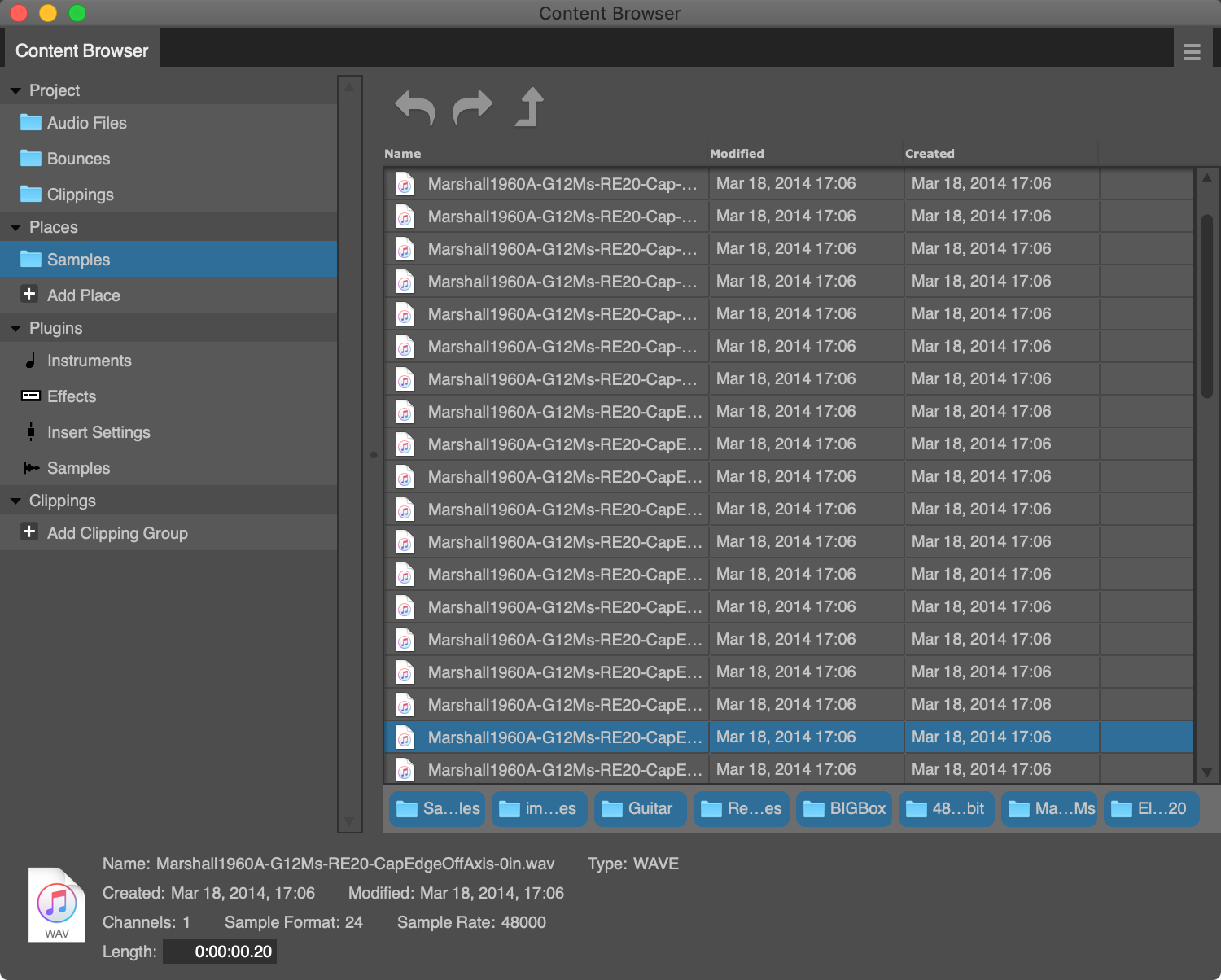
Digital Performer has rightfully had a vocal contingent that disliked the absence of an integrated browser.
Now they have something even worse than the OS’s integrated browser! Hooray!
Let’s talk about what you can’t do:
- Control the transport.
- View waveforms/MIDI.
- Nor can you select anything.
- See plugin information.
- Tag.
- Search.
- Preview instruments/effects.
- USE effects or instruments.
- They can’t be dragged or inserted unless there’s a preset, which there isn’t for VST2/3 for me.
- Process selections, since you can’t select anything other than ‘the file/effect/instrument’.
- Can’t process files either.
What CAN you do?
- Save ‘places’ (directories)
- Save and recall Clippings, which is DP’s way of saving almost anything (including tracks/sequences).
- Browse directories you’ve painstakingly added, manually.
- Browse effects and their presets (no presets show for VST2).
- Browse Instruments and their presets (once again, VST2 doesn’t show anything)
As you can see in the screenshot, the information at the bottom is cluttered and difficult to read (white on grey?).
Window’s Explorer and macOS’s Finder are vastly superior to the Content Browser in DP10 other than the CB’s ability to dock it in the main window.
I understand that maybe there was pressure to add a feature like this, but it’s half-cocked and quite a poor show. I don’t understand how people at MOTU weren’t embarrassed to put this out! Even the DAWs that people make fun of as “toys” or “hobbyist” products have significantly better browsers! Even the text editor I’m writing this in has a vastly superior browser! Maybe they thought that they needed something to go along with the Clips Window, but that’s not the greatest reason, obviously.
Every single DAW on my system has a better browser. EVERY single one. If I had Audacity installed then at least DP would win over that, because Audacity doesn’t have a browser. Wait, I take it back, no browser is an improvement.
I know MOTU knows what I think about this already, but c’mon guys. What a shame.
Conclusion
Most of these things are not a big deal to users of other DAWs. DP10 has largely been a quality of life improvement for existing users. How many people can say that about their DAW’s updates? “Yay, they made my life better instead of adding random stuff I don’t care about!”
Not many people can say that. (Image Line does great at this though!)
The content browser is in an unfortunate state currently. The Clip Window is not what it appears to be, or much of anything really. Let’s just assume these features don’t exist at all.
When you take what was added, it’s still a really great update. Yes, it’s mostly features that other DAWs have, but now DP has them. Do other DAWs have chunks? A huge variety of MIDI tools? An easy way to work in a huge project and the tools to navigate those projects? Project-wide logic-based search Five types of MIDI editors (two of which are notation), one of the best stock plugin selections, ZTX, a proper meter bridge, POLAR, clippings, offline branching undo, fine-grained track grouping, possibly the best sounding automation, OMF/AAF support, Support that might actually respond to you, video support and…
Yeah. Every DAW has a selection of those features. DP has them all.
That’s not to say that DP isn’t without some faults, but it certainly has had a leg up on other products for a long time in many areas.
It’s easy to see this update as DP playing catchup, but I’ve always felt DP was a jalopy that somehow was just behind the head of the pack. They’ve fixed it up that beat up old clunker and in the last 3 versions it’s starting to break to the front.
Hopefully in 10.5 we see some major updates to two certain features though :)
Support Me!
This post took 14 hours to research, screenshot, write and edit. If you appreciate the information presented then please consider joining patreon or paying me for my time spent bringing you quality content!