Reaper isn’t all roses and sunshine. Even though it’s chocked full of neat features and more, there’s some ugly warts.
I’m going to go through the things that have really bothered me in my Reaper demo thusfar…
Contents
- Inconsistency
- Disregard for established standards
- Terrible UI
- User Guide
- Community (outside the reaper forums)
- Learning Curve
- Project load time
- Defaults
- Conclusion
- Support me!
Inconsistency
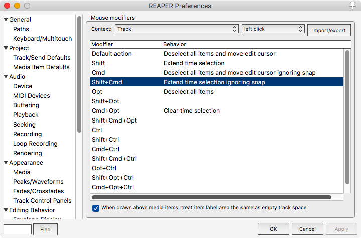
There’s quite a few things in Reaper that are strangely inconsistent by default. Take the above example: In most other places in the software, shift is used to ignore snap, but if you are Extending the time selection then you add “Command” to bypass snap.
Of course you can change this, but then it opens up a new host of issues that you have to sort through to make sure that the changes you’ve made are consistent with the other defaults. It can become maddening!
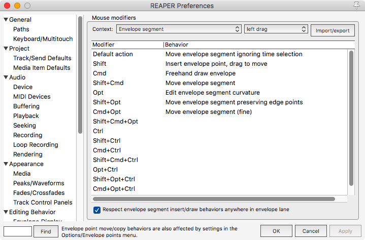
Another example with the shift key. Even though for this command there’s no horizontal movement, the “Shift” key has been assigned a task that has nothing to do with snapping. I think most users by default double-click the envelope to try and add a point (which doesn’t work!), and nobody would rightfully think to use the “ignore snap” key to add a point!
Mouse modifiers are an easy target, but there’s plenty of other things:
- Projects only save window positions that are manually set - You can open your project and it looks totally different than when you closed it if you don’t know the workaround!
- Every modifier is inconsistent. Sometimes “Command” duplicates, sometimes it adds, sometimes it deselects something etc…
- File dialogs are all over the place - If you open a file dialog to search for a file, you never know which dialog you’ll get. Some of them are strangely missing commond options like “New Folder” and browse types.
- Floating windows - Like a box of chocolates, you never know where your windows are going to be unless they are docked… except see point 1.
- OS X menu bar is FUBAR - depending on what window you have open, the menu bar in OS X changes. If you have the mixer open the you can’t access any of the normal Reaper top-level menus! Same goes for most, but of course not all dialogs. (If they all at least acted the same, that would be to consistent)
- GUI spacing - spacing is all over the place. Control placements from other elements, edges, line-spacing etc… all over the place.
- Menus - Where do you think you’d find the “Take Lane Behaviour” menu? Obviously in the Items->Take menu right? No! It’s under Options. What about “Play all Takes”? Items->Take right? Hah! No. Items->Item Settings! There’s probably a few dozen of examples like this!!
- Docking - What’s dockable? What’s not? Who knows until you try!
This section is becoming disheartening to continue writing. I’m just going to stop here.
Disregard for established standards
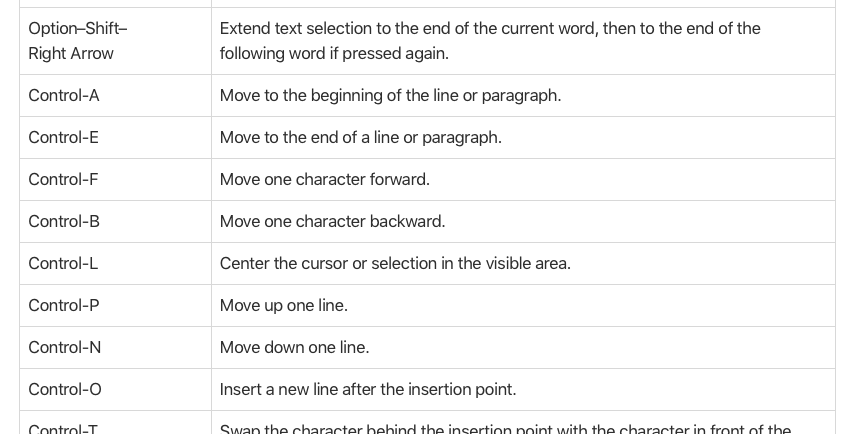
Every OS has its own established set of shortcuts. In macOS, I frequently use all of the text-editing shortcuts and window management. Reaper supports basically none of it.
I can’t tell you how many times I’ve tried to type opt-arrow, ctrl-f, backspace, (letter), ctrl-a, (word), ctrl-E etc… to open my eyes and see that I’ve just created some sort of ridiculous mess of text.
Of course it’s not only text. Very useful commands like cmd-`, which cycles through in-app windows, do nothing in Reaper. With all of Reaper’s dialogs and windows it can become infuriating to have no quick way to cycle through them.
Then we come to things like common modifier usage. In OS X/macOS, the option key is almost always used for copying something. Command is usually used for bypassing grids/snapping/alignment. Not in Reaper. For anyone that’s used to how things are usually done in their WM/OS, the cognitive load is increased a good bit.
Edit April 6:
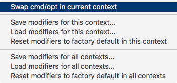
If you click the Import/Export button, you get a menu. (Weird, right?)
That menu has an option shown above to switch command and option. (What does this have to do with import/export?)
That does help somewhat with the whole option/command switcheroo. The problem is that you need to do this for every menu almost! Ugh.
Terrible UI
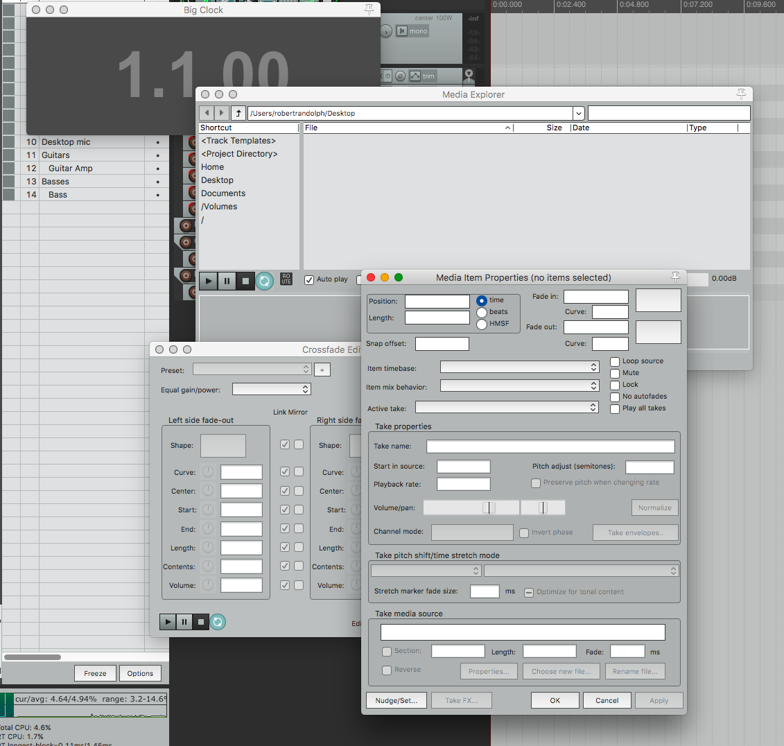
Reaper has a number of GUI faux pas that can make for an awful experience. Often people will simply recommend that you ‘try a different theme’. That’s not the issue. It’s not about the skin, it’s about the pig.
I’m going to cover a number of things about the UI that detract from the overall experience of using Reaper that are not fixed by a coat of paint.
(Or you can just count the 20+ things wrong in that screenshot alone.)
Menus
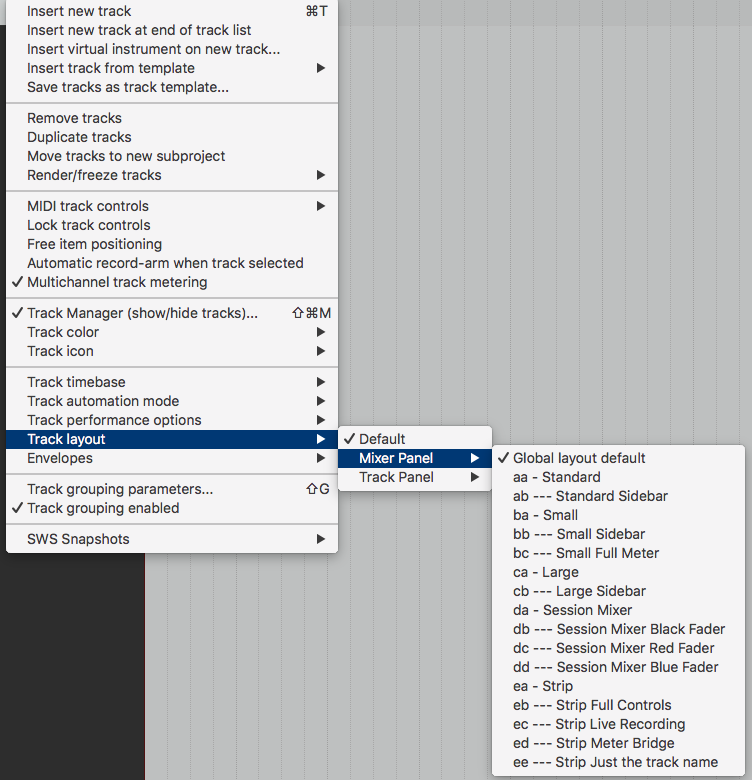
Reaper has so many menus! Man, it has menus. Multi-layer menus. Contextual menus. Menus that change depending on the top-level window. Menus with tiny contexts.
Navigating menus is a pain. Reading dozens of items to maybe find what you want, then track through potentially multiple layers (which of course you’ll mistrigger once or twice), then find out that somehow you clicked through the menu and it removed your selection.
You can change the whole menu system though. That’s what every musician wants to do right? Redesign their DAW’s menu system instead of making music.
Tiny hot-spots

Contextual hot-spots are all over Reaper. Tiny little places that change what your mouse, shortcut or menu does.
It’s really annoying to think you finally got your cursor in just the right place, then it slips a pixel when you click and BAM! you just deleted something.
Too many options
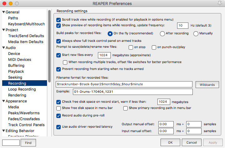
Options can be awesome. If you know exactly what you want then Reaper gives you the tools to get there. Not everyone wants that though.
When doing creative work, context switches and cognitive load are the enemy. Reaper gives you enough rope to hang yourself and chop off all your limbs at the same time. While that amount of power is great for someone that knows what they are doing, often even the most intelligent people will be in “idiot mode” when working on music.
Even if you somehow have a handle on all the options, it’s possible to morph Reaper in to almost a totally different program. A program that you may never recover if you lose your settings or have to use someone else’s rig (as if you’ll ever meet another Reaper user in the wild anyway).
Too many options sucks.
Theme-confusion
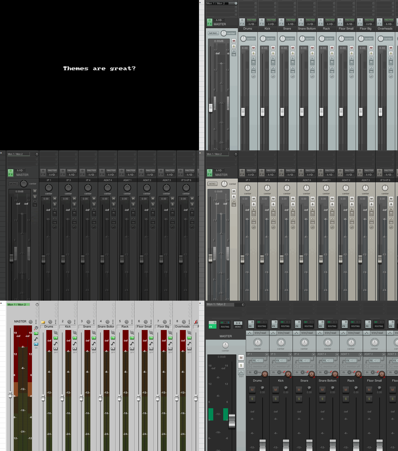
Reaper has a very powerful theming system called Walter. You can do things with Walter that are not possible in any other DAW’s theming system… That’s not a good thing.
Depending on what Theme you are using, controls are moved or removed. Changing themes can completely change what tools you have access to, or what you think is available.
There are some very pretty themes out there for Reaper, but none of them address the basic UI issues and many of them actually make the problem worse by disconnecting you from the available resources.
Tooltips suck
Reaper’s tooltips never work right in OS X/macOS. They are cutoff on screen edges, sometimes blurred or mangled and not all of them list the shortcuts associated with the action.
If this is a bug then it’s been around since Reaper 1.0. They were busted on Windows back then too.
User Guide
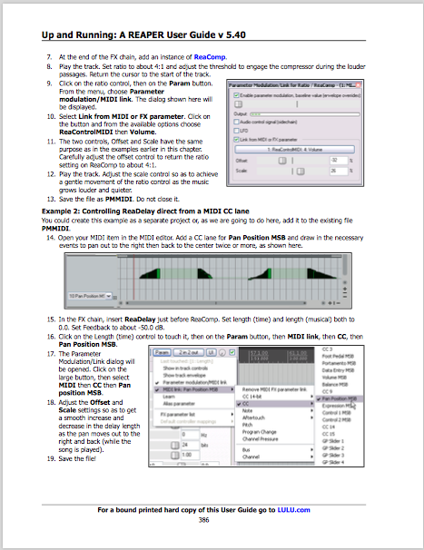
Let me start out by saying that I understand how much work it is to write and maintain a technical document for such a large piece of software. It’s not easy, it’s thankless and it’s tiring.
Unfortunately those things do not change the fact that the Reaper User-Guide is not very good. Yes, I have high-standards for technical documentation, since I basically read every manual of every item that I own (I am not exaggerating). Reaper’s User Guide is quite poor and the thanklessness of the job will continue.
- The formatting is inconsistent (I’ve checked multiple PDF renderers)
- The layout is difficult to read. Presence of images can turn an explanation to 2 words per line.
- It’s missing information
- Way too many walk-throughs instead of technical information
- Typographic disaster - This could have a whole post itself.
- Frequent terminology mistakes (or is it Reaper that’s wrong?)
- It’s not linked
- Information for some functions is “hidden” in walk-throughs that a more experienced user may not think to look at.
- Footnotes across page/spine boundaries
- Images/descriptions across page/spine boundaries
- WAY too many images.
It do appreciate that the manual exists, but it’s yet to serve me any purpose other than to frustrate and confuse. I always prefer to read manuals than watch videos, but Kenny’s Reaper Videos are vastly superior to the User Guide, even for someone that hates watching videos.
Geoffrey Francis, if you read this, I am willing to offer much more specific and targeted criticism with examples if it would help improve the user guide.
Community (outside the reaper forums)
People at The Reaper Forums are awesome folks. While there are some morons there like any public or near-public space, it’s an overall positive and progressive group of people.
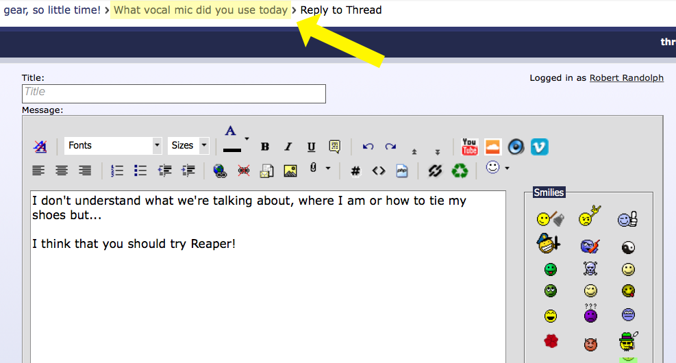
The real problem is outside of the Reaper forums there’s a number of users that, baffling scientists worldwide, somehow manage to operate a computer. You know what I’m talking about. You’ll check your favorite forum and see an interesting thread about starch:water ratios in corn bread, then someone comes along to suggest that you try Reaper.
I’m only half-joking. I’ve seen these nutjobs in the strangest of places, and rarely do they understand what they are responding to or if/how Reaper would even help the person. Often in the past Reaper wasn’t even yet capable of the workflow necessary to solve the issue.
I really appreciate the community at the Reaper forums, but in the wild, you guys suck. All DAW fanboys do, but for some reason the Reaper nuts are bottom-of-the-barrel brainless.
Learning Curve

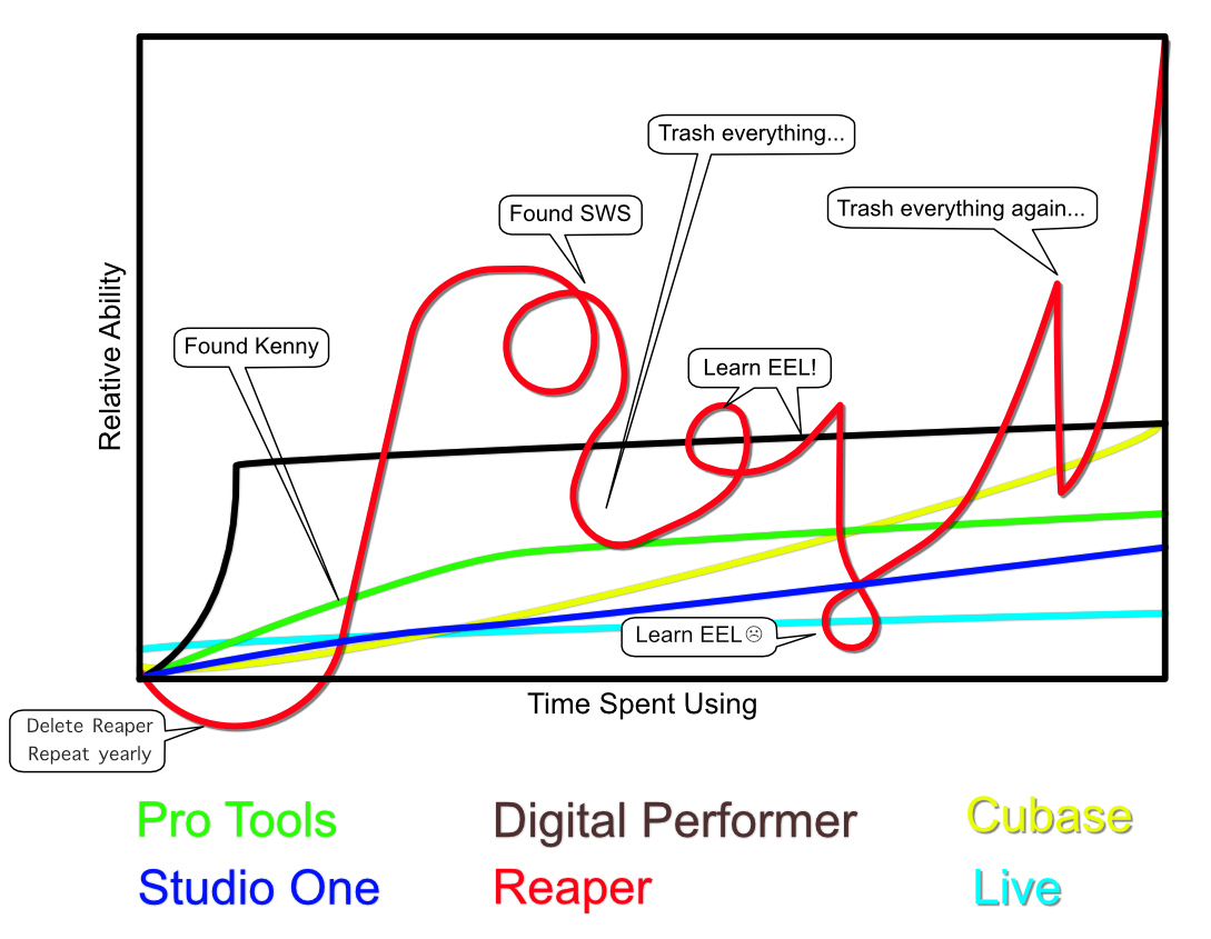
Reaper’s learning curve is incredible. The graphic is the best indicator I could come up with (by ripping off eve/editor memes) that represents how it feels to try and learn Reaper.
There’s a few things that I feel unnecessarily increase the learning curve of Reaper:
- Different terms - Reaper uses terms like “Media Item”, “Cursor”, “Action”, “Region” etc… in ways that basically require you to almost fully read the User Guide before you can try and search for help.
- Strange Defaults - Plenty of argument to be had here over what consists of ‘sane defaults’, but it seems to be almost universally agreed that Reaper’s defaults are not sane.
- Scripting-focused community - It’s awesome that Reaper has such a great scripting system, but that also has lead to an underlying attitude of “If Reaper can’t do it, then just write a script!”. That’s great for people that have time, but if you’re just trying to get something done well…
- Mouse modifier madness - Reaper has so many mouse modifiers, and they are all contextual. Almost none of them are similar to whatever OS you’re using Remembering what does what requires a note-pad.
- Forum-centric help - Reaper has no proper support team. If you need help then you have to post on the forum and wait.
- Complex routing - Reaper’s complex routing is very cool if you’re trying to do something complex, but for some simple things it can be rather confusing at first.
- Scripting exists - It’s a rabbit hole once you realize that you can do almost anything you want.
If you are new to computer audio, then it really shouldn’t be too difficult to learn to use Reaper. If you are coming from any other established program then you basically have to relearn nearly everything you know.
Project load time

In the above gif, I replicated a project in Reaper that I did in Digital Performer. Every edit, plug-in, track, send, etc.. The project has 20 FX and 45 tracks.
DP opens the project in under a second. Reaper takes about 9.
I have another more complex project with 95 FX and 250 tracks in Reaper, and I may as well go make some tea and a sandwich while it opens. DP opens projects like that in seconds.
Now I appreciate that I have almost all the undo options on, with a large undo cache. My DP projects also have unlimited offline branching undo though, and way more automation than Reaper due to the lack of media FX/FIPM.
It’s not a huge deal, but it does get really bothersome at times.
Defaults
No image for this. Reaper’s defaults suck.
Nearly every Reaper user I’ve spoken with that has more than very basic needs has changed the defaults so much as to make it unrecognizable to another user.
Perhaps this is a good thing for many people, but I feel like there must be a set of defaults that are not as widely disliked as Reaper’s.
Conclusion
Nothing about Reaper that sucks has to do with what it’s capable of. It’s 100% how you access those features and learn about them.
Eventually I think almost anyone can create a Reaper installation that does what they need, but the path there is arduous and annoying. I don’t know what can reasonably be done to alleviate this given how much Reaper can do, but that does not change the fact that it is really a difficult DAW to get going with.
Support me!
This post took 10 hours to research, photograph, write and edit. If you appreciate the information presented then please consider joining patreon or donating!